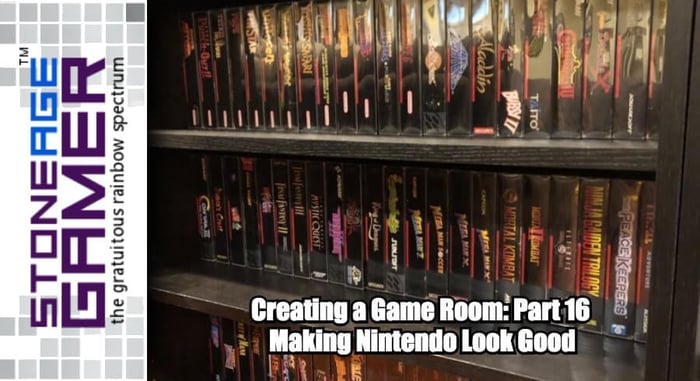
Creating a Game Room: Part 16 - Making Nintendo Look Good
Finding order in chaos
Last time, we got Sega all organized and ready to go. Sacrifices had to be made, but it looks spectacular. Next up was Nintendo, and that was a considerably more daunting task.
Having done Sega first, the idea of keeping things uniform was extra strength ingrained in my head. Super NES games would surely be a relatively easy task, what with them adhering to some standard form of box art, but NES was going to be at the top, so I began there.
Silver lining
First I lined them all up alphabetically and, well, it looked cool but messy.
I had a feeling from the get go that this was what I wanted to try, and with straight alphabetical order proving to just be too messy for what I was going for, and having sacrificed the alphabet to make Sega pretty already, it was time to start separating my games off by publisher.
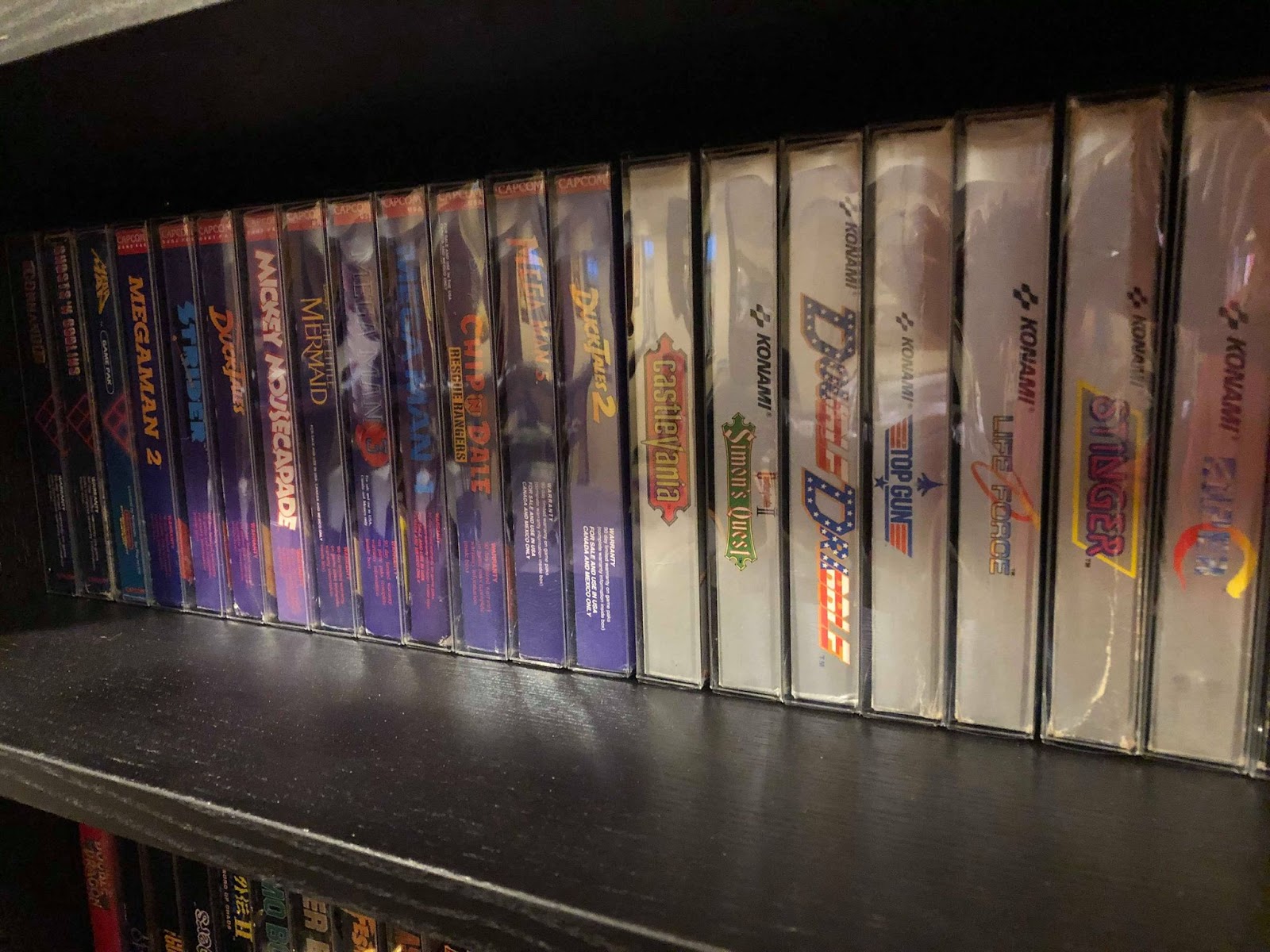
Konami was the first one, with their silver label games a shining example of how great NES boxes can look when lined up. Then I got all the Capcom stuff together and separated them into 2 piles, one for their first run stuff with the weird grid in the background, and another for their purple border stuff. Nintendo black box games were another easy group to get together, and then I gathered the non-black box Nintendo games, which look surprisingly great next to one another. They obviously don’t have a strong single color design like Sega’s games did, but with the Nintendo logo always in the same place and them all being a single bold color on the spine they actually look wonderful.
That wasn't enough to fill the space I had though, so the rest got grouped in much smaller bunches. A few Broderbund games here, a short stack of Ultra there, a smattering of Sunsoft, you know, the works.
Once I had them all lined up, it was still considerably more chaotic than Sega, but it looked really nice. It also gave me some ideas for what I want to get next.
Not so black boxes
After Nintendo stopped with their black box games, they did a run of 3 silver box games, Rad racer, Kid Icarus, and Metroid. I know I’ve seen repro boxes out there that recreate those covers in black box style, and I want them. I also want to complete some more of my actual black box titles if possible, but that’s an expensive endeavor, even if I’m just doing repro boxes. I’ll mull it over.
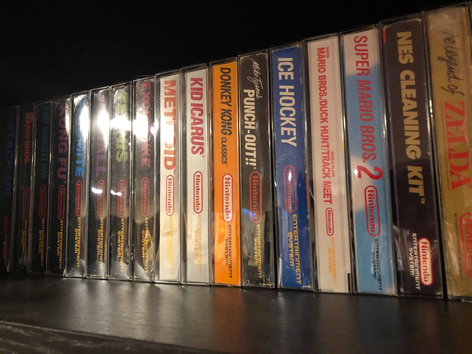
Anyway, after the silver boxes, they switched to this other style that I don’t really know what to call, and in fact I didn't really recognize it as a recurring style until I started stacking these games up. Super Mario Bros. 2, Donkey Kong Classics, Mike Tyson’s Punch Out, Ice Hockey, these all share a similar style to the black box games, except with solid colored backgrounds instead of outer space, and actual artwork instead of recreations of the in-game sprites. They’re fantastic! I don’t know how many other games released with this style, but I’m pretty sure Cobra Triangle is one of them. I have that game cart and manual, and I must get a box to add it to the shelf.
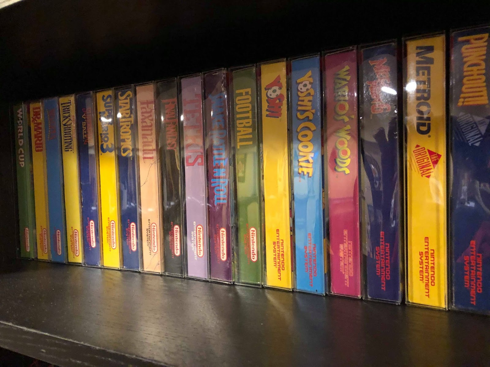
Then I moved onto the regular Nintendo stuff with the red stripe at the top, and they just look cool. They match in a really fun way, and I definitely want to try and fill this one the rest of the way with just these. Next down came the third party stuff, and this one killed me because I had to break up my Mega Man games. The first one is in Capcom’s grid style, then 2 -5 are all purple border games (though I still had to split them up when the top Capcom logo changed) and 6 is actually a Nintendo published title! So onto the top shelf it went, away from its brethren.
Yes, this is complete madness, but it’s oddly satisfying to see the games lined up this way. Like I said last time with the Genesis games, chances are if I’m going to be playing these games I’ll be doing so with an EverDrive, so it’s all about making the shelves look pretty, and pretty they do look!
Playing with Super Power... and ignoring visual guidelines
Next up was Super NES, which I thought was going to be a breeze since everything was so uniform, but NOOOOOOOOO! Of course, not everybody got the box styles right. Who was the first offender? Bubsy. Of course it was Bubsy.
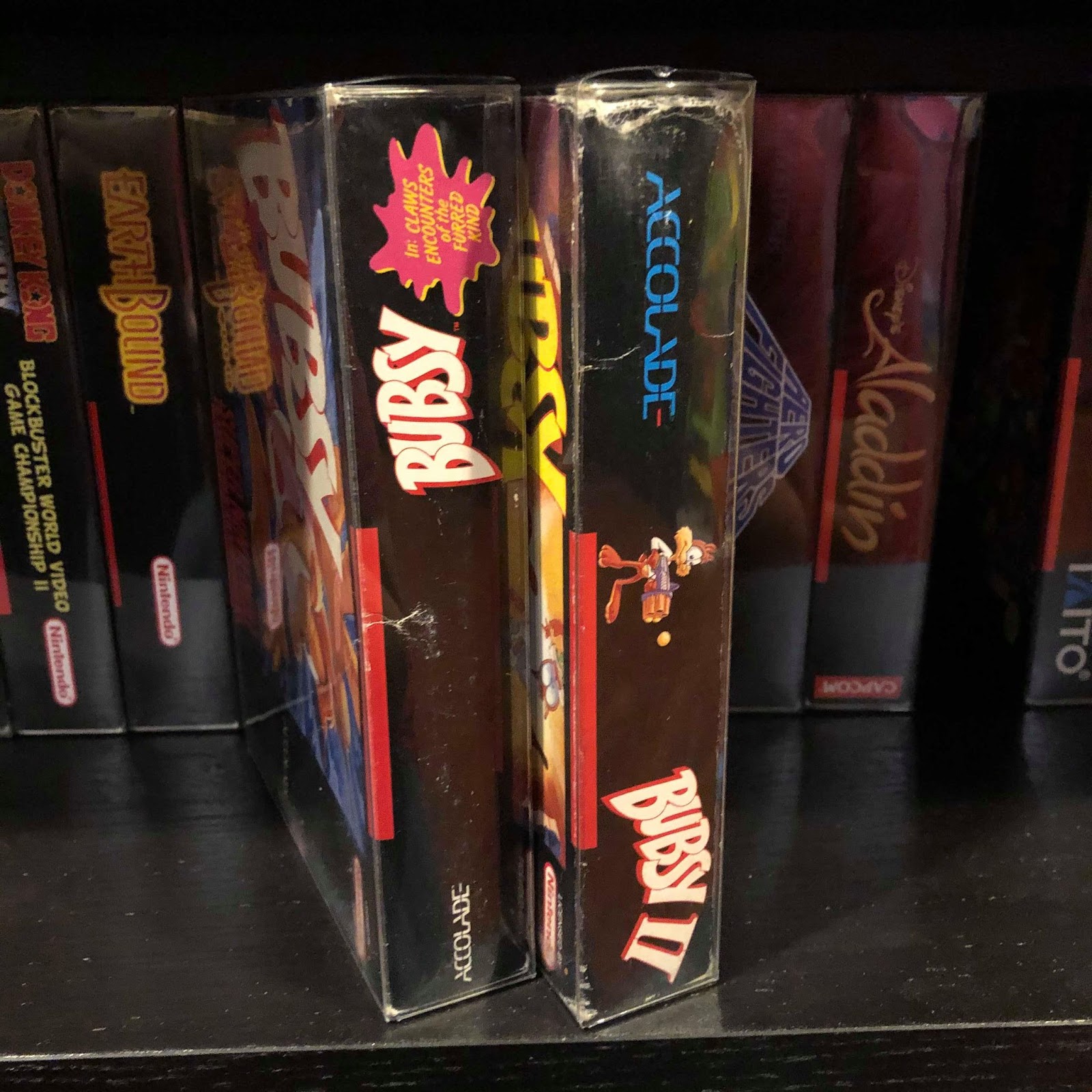
I mean, look at this. The first game has the logo upside down, and the second game has the logo at the bottom for some unknown reason. What the heck, Accolade?
I couldn’t tell you why this happened, but it seems several Super NES games, not just Bubsy, have the words pointing the wrong direction. So now Lemmings and Lemmings 2 can’t sit together. Cool Spot and Knights of the Round, I’m very disappointed in you! This enraged me to no end because SNES is my favorite platform, and I want as many of these games on display as possible because they mean the most to me, but having those gams upside down would irk me forever, and flipping them around doesn’t help because of the red stripe being in the wrong place.
After jiggering around with the setup for way too long, I decided some drastic measures needed to be made. There were far too many minor variants for my liking, so I decided to pull all the Nintendo published stuff and see if they at least all added up. And they did!
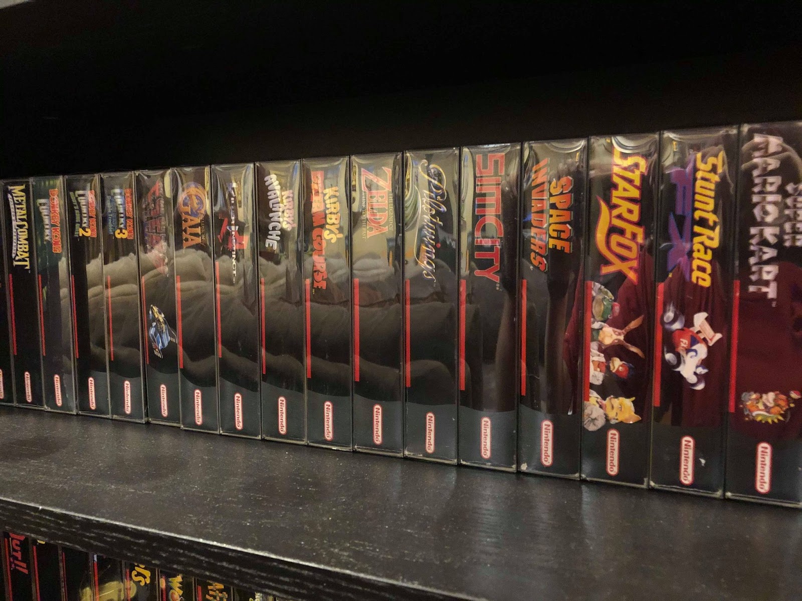
They look spectacular, with the exception of a couple of repro boxes I have. I just put them at the end so as to not screw with the look of things any more, but I’m thinking I might try and create just new spine art for them to make them fit in.
A good while ago I got myself custom standard sized boxes for the Super Scope 6 game, Mario Paint, and EarthBound. I also nabbed a box for Mario All-Stars + Super Mario World. They look amazing, but not a darn one of them matches the standard Nintendo boxes on the spines. So yeah, that’s infuriating.
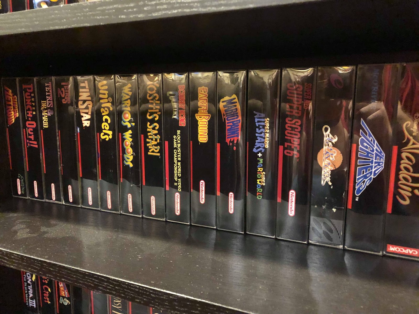
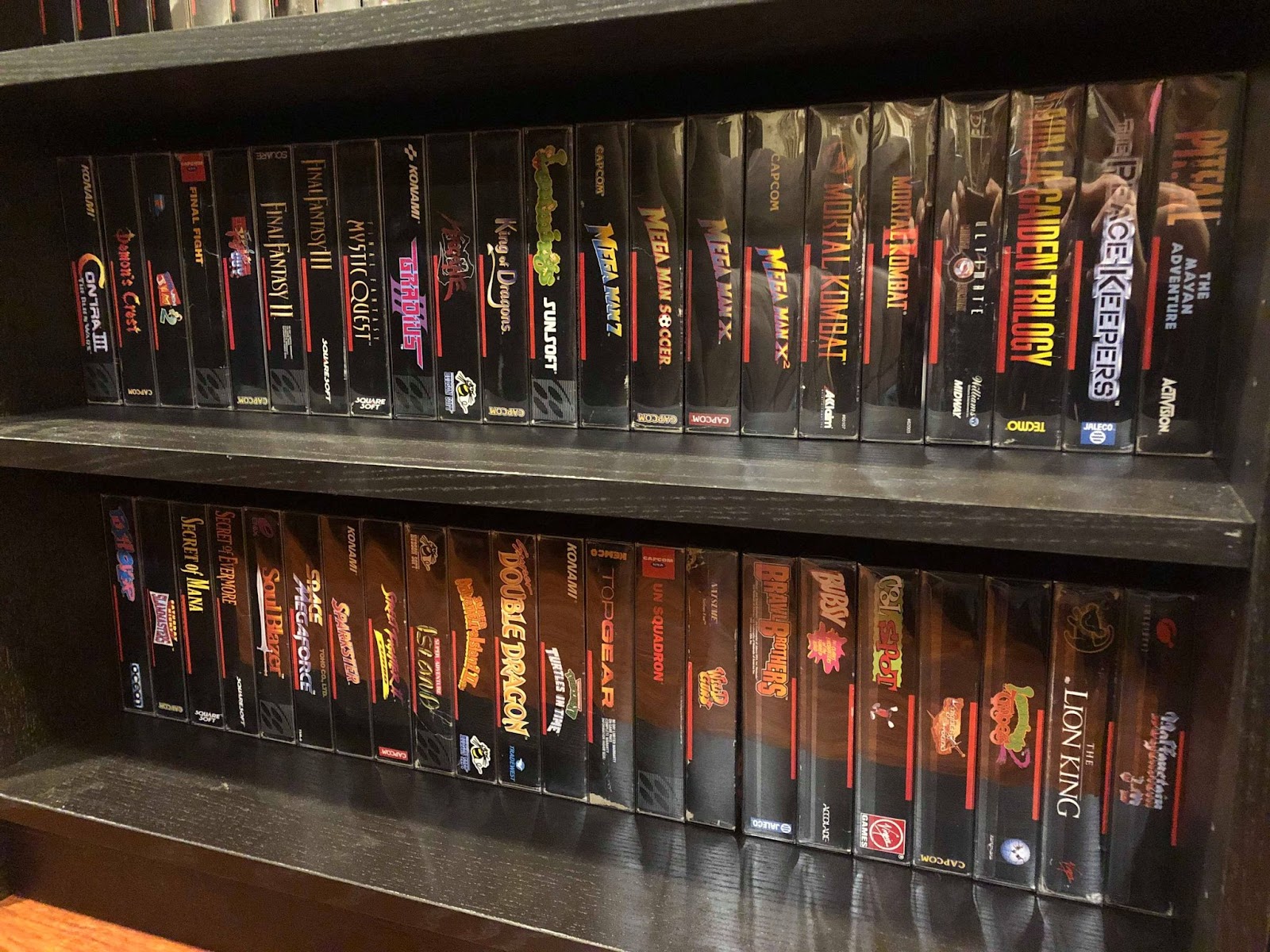
So what I wound up doing was grouping all the Nintendo published stuff together, then the repro boxes, then the rest of them, then the jerks with the upside down spines. It isn’t the glorious perfection that is Sega’s lineup, but it all still looks pretty nice.
With The Middle shelves dedicated entirely to NES and SNES, that just leaves all the other Nintendo platforms, PSX, PS2, Xbox, and Atari. That should all fit… right?
The Game Room story so far:
Creating a Game Room: Part 15 - Overdoing it on Organizing
Creating a Game Room: Part 14 - At Long Last, SHELVES
Creating a Game Room: Part 13 - Adventures in Consolidation
Creating a Game Room: Part 12 - On the Blink
Creating a Game Room: Part 11 - Reclamation at Last
Creating a Game Room: Part 10 - Paint it Black
Creating a Game Room: Part 9 - Inspiration From Above
Creating a Game Room: Part 8 - A Nice Place to Sit
Creating a Game Room: Part 7 - Two Steps Forward…
Creating a Game Room: Part 6 - Love (HDMI) Connection
Creating a Game Room: Part 5 - CRTs are Heavy
Creating a Game Room: Part 4 - Arcade Dreams
Creating a Game Room: Part 3 - Shelf-Satisfaction