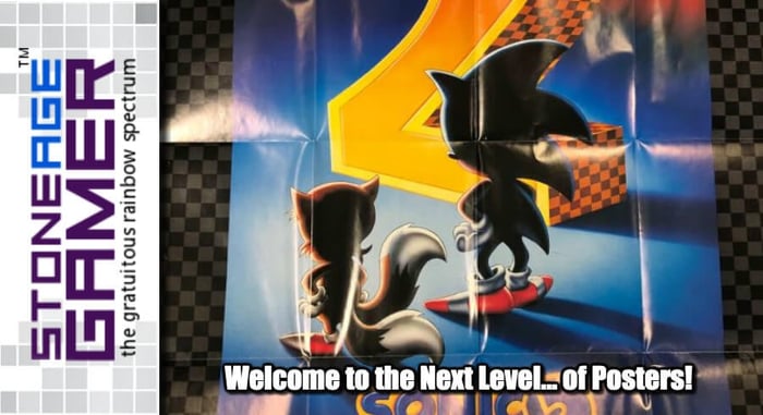
Welcome to the Next Level... of Posters!
Posters of the Sega Persuasion
Last week I wound up writing about the lack of video game posters in new video games, and honestly, I had a blast. My office where I work is littered with most of the posters I showed off last week, and digging around my drawers and looking at stuff I brought here a couple years ago but ran out of room to hang up was stupid fun. It got me thinking, that stuff was just the tip of the iceberg. There’s still so much more! So, I’ve decided to dive even deeper.
I went into my basement and grabbed all the promo stuff I could find, and divided it up into categories. I’ve managed to hold onto a pretty decent number of these things over the years. But where to start? Well, Nintendo was the main focus last time, so this time, let’s talk about Sega!
I’ve always been more of a Nintendo guy than a Sega guy. It wasn’t until much later in life where I came to truly appreciate all they had to offer. Yes, I had a friend with a Master System, and yes, I do (and did) think that Master System I showed off last week poster was super cool, but it wasn’t until Sega released Sonic the Hedgehog when I was truly jealous of my Sega-owning pals. I didn’t start actually collecting Sega stuff on my own until probably a little after the PlayStation came out. So naturally, I don’t have the same reverence for these posters as I did for most of the Nintendo stuff, but I still appreciate them for what they are.
And what they are is different! These things are strikingly different from any of Nintendo’s posters, and I have to say I’m constantly shocked at how not-extreme they are. So much of Sega’s marketing back then was about being cool, but most of this stuff comes off as more sleek than rad. Let’s start with the earliest one I have.
In the beginning
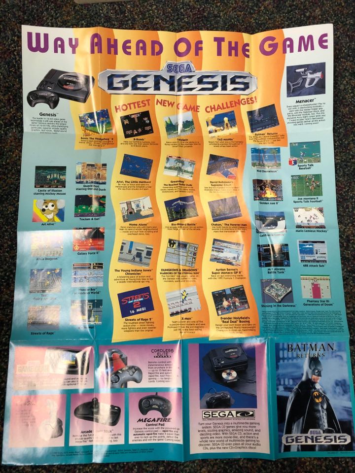
Okay, this isn't exactly the beginning, but "genesis" wordplay is fun, and "way ahead of the game" is right! I don’t have any personal experience with Art Alive outside of this poster. I don’t think I’ve ever even seen it in person before, but apparently it came out a year before Mario Paint. Outside of that, there’s some cool accessories on here like the Menacer, arcade stick, and wireless controllers. And of course, let’s not forget Sega CD!
That said, there’s a reason my eyes always went right for Art Alive whenever I saw this poster. It’s the most interesting-looking thing about it. Seriously, this is some seriously uninspired design right here. There’s no question it’s better than the Master System one we saw last week with all the blank white space, but when it comes to cool visual design, Nintendo was lightyears ahead of this teal and yellow weirdness. However...
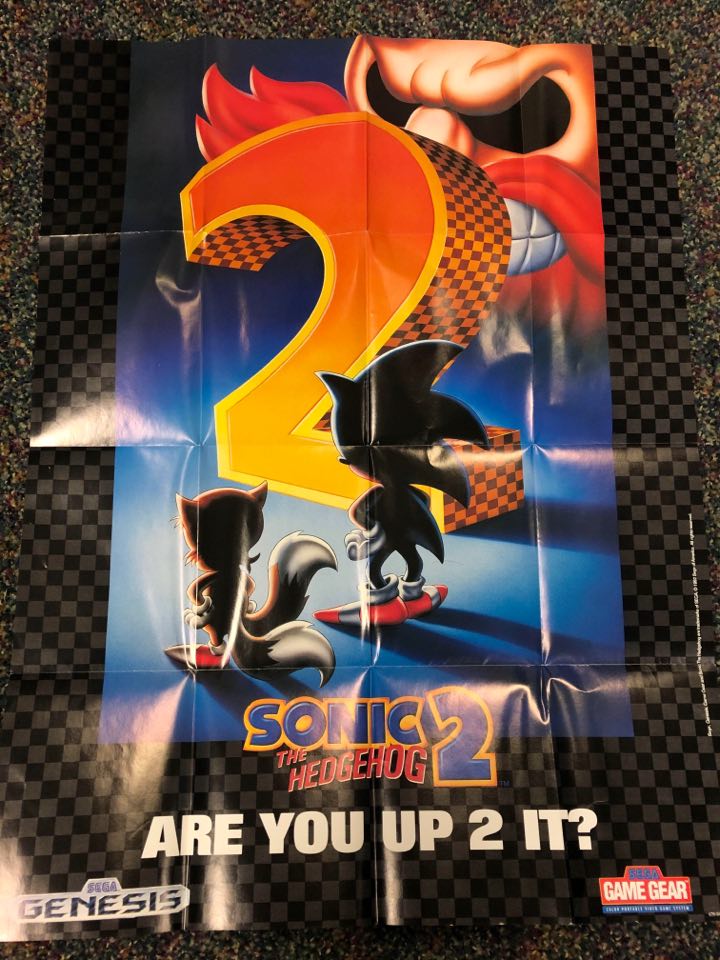
There’s absolutely no denying the awesomeness that was on the other side. Hype. Unmitigated hype. Such intense hype that even my Nintendo-loving butt couldn’t help but be impressed. This is such an amazing teaser image. Having Sonic and the then-new character Tails with their backs to us was a great call, and having them standing confidently in front of a giant 2 and an even more giant Robotnik was just pure perfection. Having the game’s final US cover art basically be the same thing with the two protagonists turned around was also a stroke of genius. Heck, just about everything about Sonic 2 is genius. Well played, Sega. I was up 2 it indeed.
And things just got better from there.
Welcome to the Next Level
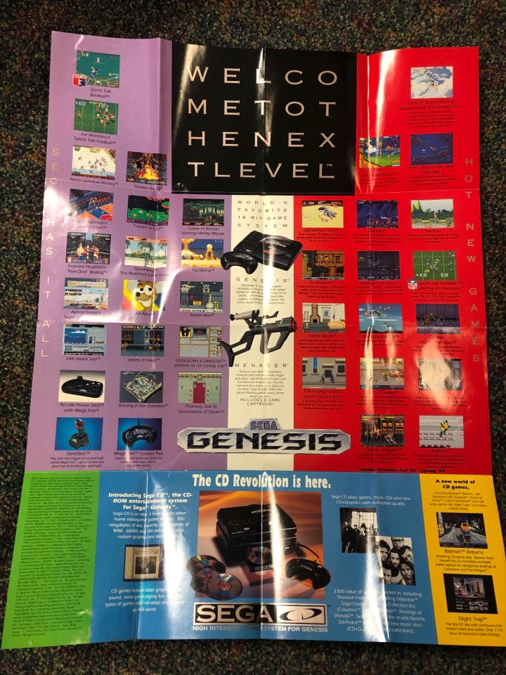
Welcome to the Next Level, Sega! Now we’re talking. The bold red in particular here kicks this whole poster into a much higher gear than the Batman Returns one above. Really, the whole bright color blocking look absolutely kills and makes the Genesis look like a real badass machine. It’s still got the same great screenshot for Art Alive, but the rest of the images just seem to pop more here as well, even though most of them are the exact same ones from before. It’s just a much better layout overall. And what of the other side?
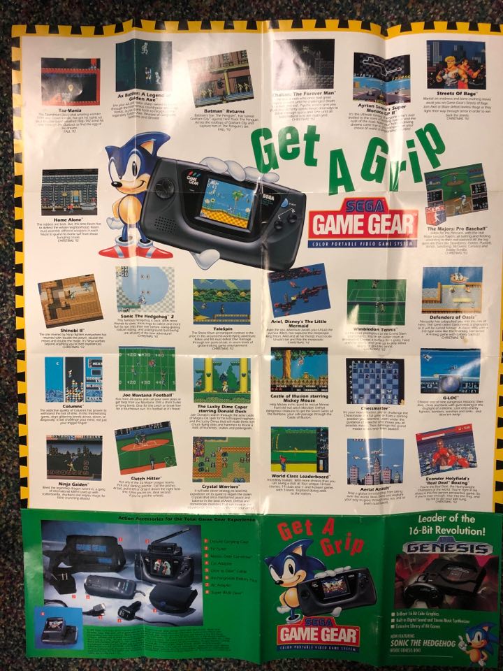
Dedicating the other side of the same poster to Game Gear is a cool move I wish Nintendo did more of. For a while, Nintendo posters were all NES, or all Game Boy, or all SNES. Sega was all about promoting that synergy. If you had a Genesis, they wanted you to have a Game Gear too, and they weren’t exactly shy about it. While they couldn’t ultimately compete with the Game Boy in the long run, the Game Gear put up one heck of a fight. And seriously, just look at those screenshots. Being a Nintendo fanboy at the time, there was no way to look at those screenshots and not be the tiniest bit jealous of your Sega-owning brethren. Those graphics were killer for a handheld, and this poster did a great job of showing that off. It’s not as starkly awesome as the reverse side, but it’s still pretty nice.
Now this one here is the one I probably have the most of laying around. I know there are about a bajillion more Genesis promo posters I just didn’t run across when I looked for these, but I swear I have at least 6 of this one poster sitting around. Which isn’t really a bad thing, because it’s a pretty good one.
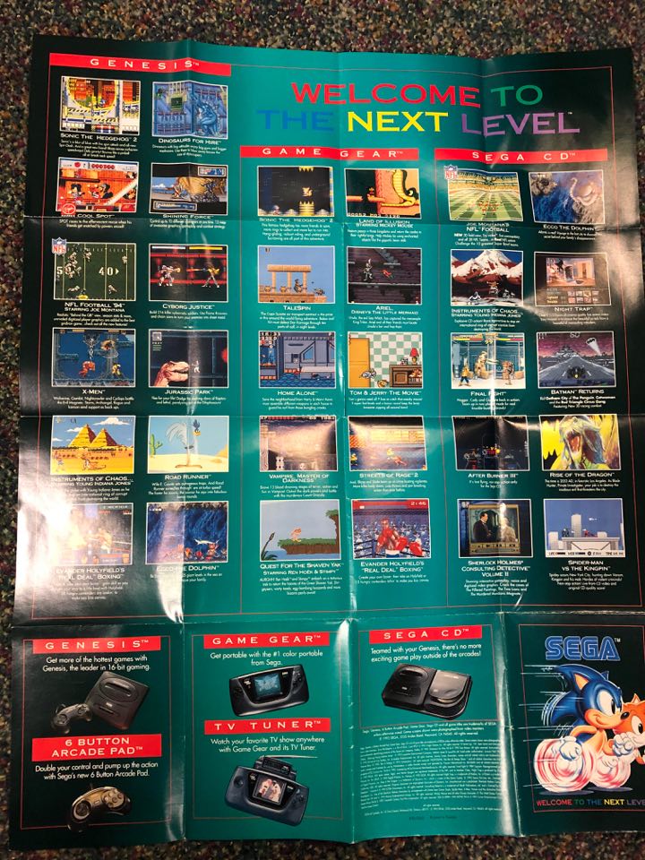
The move back to the teal color was an odd choice, but it really works here with the black fade out on the sides. Here we have Sega showcasing the ultra cool Genesis 2 model as well as the Sega CD Model 2 to go alongside it. 6-button controller for the Genesis, TV tuner for the Game Gear, with Sega you’ll have it all, kids! Now let's look at those games!
There isn’t a ton of quantity here, but there doesn’t have to be. This was Sega firing on all cylinders to cut Nintendo down to size. Sonic 2, Ecco the Dolphin, and NFL 94 were excellent showpieces for Sega, but the exclusive licensed Jurassic Park and X-Men games were as huge as huge could be. Jurassic Park had taken over pop culture, and X-Men was one of the biggest cartoons on the planet. The actual quality of those games notwithstanding, the Genesis section here delivered some next level hype.
The Game Gear bits were no slouch either. The giant snake in the Land of Illusion screenshot is a real eye-catcher, and handheld Sonic 2 and Streets of Rage 2 were pretty decent showstoppers in their own rights.
Then you move on over to Sega CD and see that awesome Batman Returns image, Final Fight on the same poster as Streets of Rage, a pseudo 3d looking Joe Montana’s Football, and that brutally cool Rise of the Dragon image, and you’ve got yourself a pretty sweet incentive to convince your parents that buying a Sega CD is an absolute necessity.
Meanwhile, on Saturn
Moving on, I missed a heck of a lot of other Sega posters. I’m sure I have some of them around
somewhere, but as far as what I had handy, the next thing I found was this cool Sega Saturn pamphlet.
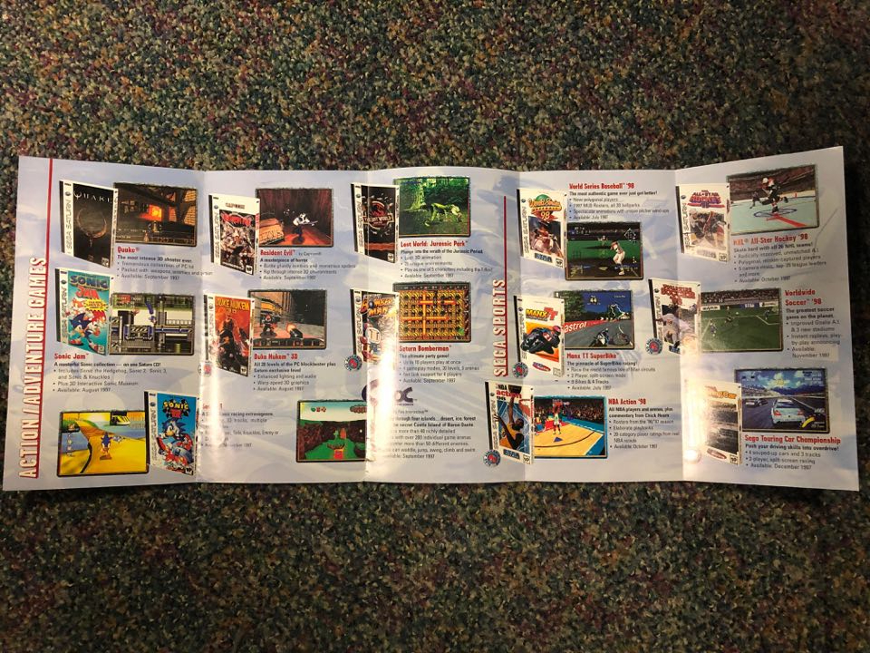
This has always been my least favorite era in gaming, but there’s really something to be said for the Sega Saturn’s innate coolness. There’s something about the look of a lot of Saturn stuff that holds up better than Nintendo 64, PlayStation, or 3DO games to my eyes. This is a pretty great lineup, too. Resident Evil, Duke Nukem, Quake, some of the biggest names on PlayStation playing alongside stuff like Sonic R and Saturn Bomberman is a good look. And then there’s the other side!

Sorry about the picture quality, but man, Enemy Zero, Shining the Holy Ark, Fighters Megamix, even if you aren’t a fan of these games, Saturn had some killer cover art. And speaking of killer, you see that guy in the lower left corner? Here, have a closer look.
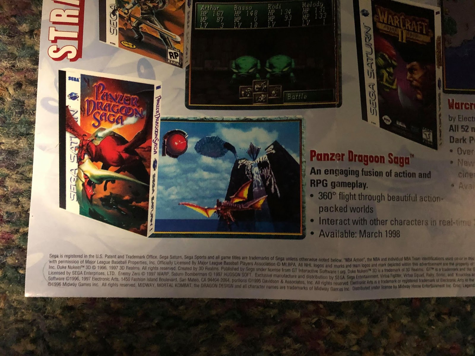
Check out that completely different cover art for Panzer Dragoon Saga! It still kills me that this game wasn’t anywhere near as big as Final Fantasy VII, and that it hasn’t been remastered and put on modern consoles yet. No joke though, this pamphlet painted a very pretty picture for Saturn owners back then. It ultimately didn’t end up so well for them, but you can’t say it didn’t go down swinging.
THQ Does...
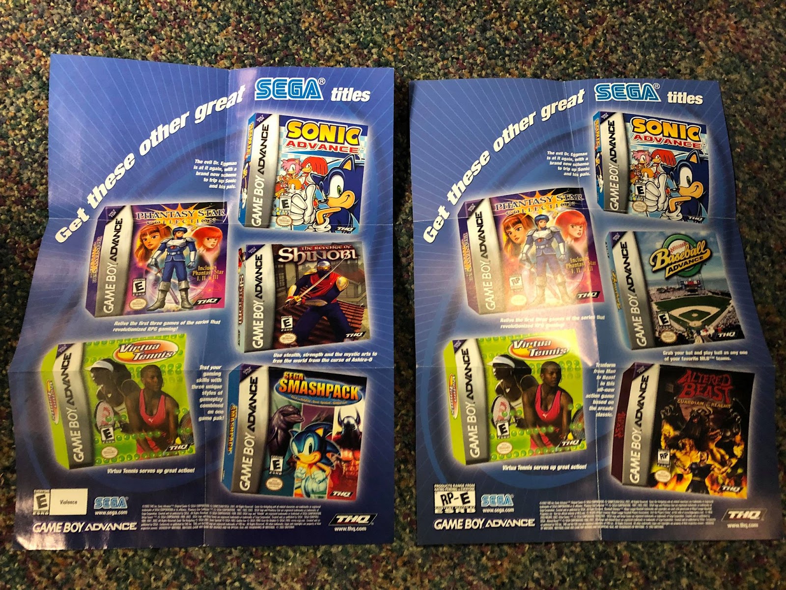
The last ones I have that are Sega-specific are these two from the Game Boy Advance era. This was back when THQ was publishing some really great stuff for the platform. Once Sega went 3rd party, they had their fair share of misses, but Phantasy Star Collection in the palm of your hand, a brand new Nintendo-exclusive Sonic the Hedgehog game, and an honest to goodness awesome sequel to Altered Beast were really something. The backs of these guys were pretty nice too.
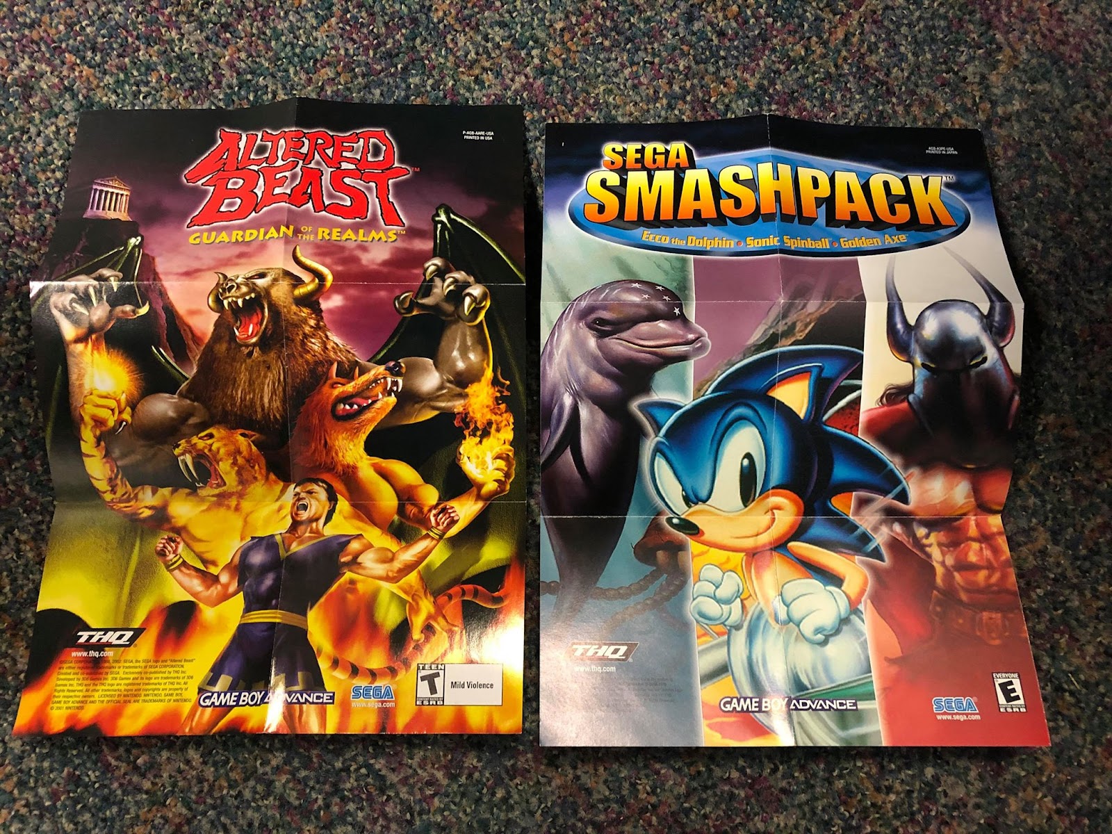
Guardian of the Realms didn’t have the greatest art direction I’ve ever seen in a game, but they made the Altered Beast formula legitimately fun and I’ll never be able to thank them enough for that. That Smash Pack art is pretty sweet too.
And that about wraps it up for my Sega posters. I’ll always be a Nintendo guy at heart, but appreciating what Sega was doing while I was fanboying as a kid isn't exactly hard. Come back next week when I’ll take a swing at some of my 3rd party posters.