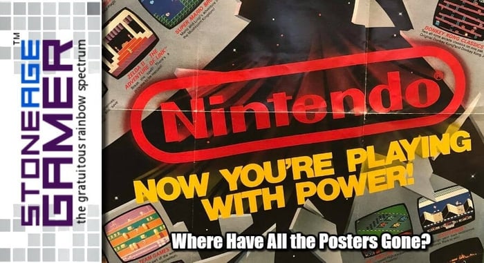
Where Have All the Posters Gone?
I understand that physical media isn’t exactly what it used to be. Folks aren’t going to stores to buy the latest and greatest games nearly as much anymore because why leave the house when you can just download, right?
But it’s not like physical media has up and gone away. Best Buy, GameStop, Target, these places still carry plenty of brand new games, and those games come in cases. But those cases are mostly empty now. You get your game disc or cartridge, and that’s it. Heck, sometimes you don't even get that. Just a download code and some shrink wrap is all that’s on offer with some modern games. And while that bugs me, I get it. I really do.
The time and expense that goes into a proper instruction manual is a lost and underappreciated art. In-game tutorials do plenty to teach folks how to play games anyway, so while it’s always sad to open up a brand new game case and not have a shiny new book filled with tips, artwork, and more to flip through, I kind of get it.
But the other thing that always came with my games when I was a kid was some sort of poster. Kids still have bedroom walls, right? I mean, mine do. What are kids putting up on those walls? Mine were always littered with the super cool posters that came with my new games, or the posters that came in Nintendo Power, or the posters that came in the pamphlets I’d grab at Toys R Us. Video game posters were relentlessly cool ways to show off just how many awesome new games were coming out. You could hang these things up on your wall and fantasize about what game you’d be able to cross off your list next. They’re great for building brand loyalty, and they never go out of style. So why did they stop making these masterpieces?
Let’s start with this one. It’s one of the most iconic posters I’ve ever seen. There are a couple of versions of this one out there with some different games, but this is the one I got with my first NES. We got the set that came with Super Mario Bros./Duck Hunt/World Class Track Meet, 2 controllers, a Zapper, and the Power Pad. I was already a pretty huge Nintendo fan by this point having spent countless hours playing at my friends houses. I still loved my Atari 2600, but it really couldn’t compare to the crazy stuff I had seen on NES. So when I got this giant poster in my console box, I was just in awe at how marvelous every single game looked. I wanted to have them all.
I mean, just look at that lineup! There isn’t a single proper stinker on this poster. Sure, 10 Yard Fight isn’t exactly a game I’m clamoring to play these days, and Dance Aerobics is hardly a classic, but even those games aren’t straight up bad. And the whole “Now you’re playing with power” bit blasting through this metal spaceship wall? So intensely cool! What I really love though is the screenshot for Super Mario Bros. It really looks like Mario is wearing a blue shirt, so I spent an unreasonable amount of time adjusting the color on my TV as a kid, trying to make mine look that way. Ahh, fun.
Of course if we back it up a bit, we have this little bundle of joy, and another one of my favorites. ROB has always been an undeniably cool design, even if he is kind of a crap accessory. I never saw this poster until several years after I owned my NES. But in that time I had become somewhat obsessed with Nintendo (HA, “somewhat”...) and was particularly fascinated by their black box games. I love it when a series of games matches when you line them up. So seeing this poster was beyond exciting. I can only imagine how blown my mind would have been if I came across this one earlier in my life.
I’ve also always been a big fan of Nintendo’s classic worlds, and look at the first 4 games on this poster. Super Mario Bros., Metroid, The Legend of Zelda, and Kid Icarus. That’s pretty much it for me right there. Those are my four absolute favorite Worlds of Nintendo, and here’s a poster with them all right there in a row. But look a little closer and this poster is a freaking checklist! There are little boxes for you to check off when you get all the games. What kid wouldn’t want a checklist poster that came for free with their Nintendo Switch games?
So what about what was going on outside of Nintendo? Turns out Sega had some pretty cool stuff going on too. Not nearly as cool as Nintendo’s, but still pretty sweet. And while the design of this poster isn’t even in the same universe of cool as Nintendo’s stuff, these screenshots were certainly enough to make me think twice about being a Nintendo-exclusive kid. In still shots, the Master System kills NES. Just look at Fantasy Zone II for crying out loud! It’s so colorful! But then the bottom of the poster is just… blank white? What gives? Could they really not think of anything to put down there? Not that it matters, because as cool as this is, it’s got nothing on what’s on the back of the poster.
Just look at that! Space Harrier, Wonder Boy, Outrun, Fantasy Zone, some missiles (Missile Defense maybe?) and a football dude. This is the stuff right here. “Take Hold of the Sega Adventure” isn’t as awe inspiring as “Now you’re playing with power,” but this poster did its job. This makes the Master System look like a really good time.
On the handheld front, Game Boy had some pretty rad posters. This one’s probably my favorite though because it highlights game box art instead of green and yellow Game Boy screenshots. Not only that, but it’s some of my absolute favorite box art of all time. Just look at the pure, unadulterated awesomeness that’s going on in the bottom right corner. Seriously, these are some of THE best boxes Nintendo ever made. Super Mario Land, Kid Icarus: Of Myths and Monsters, Alleyway, Metroid II: Return of Samus. Oh, and speaking of Metroid II, how about the back of this one?
Seriously. This was a free poster! This will always be one of my very favorite images Nintendo has ever produced, and they just gave this thing away with the purchase of pretty much any Game Boy game at the time. It’s so cool!
Then we have the Super NES, and man oh man look at this thing.
I get that it’s only 6 games, but as a kid who was absolutely crazy about Zelda, those three screenshots at the bottom lit my brain on fire. This is the smaller one, but the giant one that came with my launch SNES called the game Zelda 3, and I think it had the same screenshots. Regardless, I love how these are different from the final game. What’s that weird red bottle in his inventory? Why is the magic meter shaped differently? Why are there 4 statues outside the Eastern Palace instead of just 2? What’s up with Link’s hair? And of course, the perfect topper, “Now you’re playing with super power” Yes, Nintendo. Yes I am.
But as cool as that Zelda stuff is, nothing tops this.
Is there a more perfect image in the history of video games? I don’t think there is. It’s still stunning to this day. After obsessing over the first two Zelda games, and living for the Zelda cartoon to air on the Super Mario Bros. Super Show every Friday, seeing that Zelda was returning to the top down style of the original game with the power of the SNES behind it was enough to keep me awake at night. But this image, this gorgeous, mysterious image, filled my head with the sweetest of dreams. Was that the magical sword from the first two games, or was this something new? Would I get to actually walk around this place in the game, or was this just a promotional image? I had so many questions, and they were all so much fun. Man, what a great poster that was again, completely free with your game purchase.
Sticking with the cool back of the poster images, these two also stuck with me over the years. That Super Mario Bros. 3 image is another one of Nintendo’s best of all time, and even with most of it cut off on this one, it’s still a pretty cool pic. And that StarFox image! Those freaking puppets they used for the original Star Fox promo art were incredible. I wish they’d do something like that again.
Meanwhile, on the front of those two posters we have a matching set! And you know how much I love things that match! I really liked this particular time in Nintendo’s history. They had the NES, SNES, and Game Boy all active at the same time, and all three of them were thriving. The Mike Tyson-less version of Punch Out!!, the new yellow box version of Metroid, paired with the gray cart versions of Zelda and Zelda 2 made a really killer lineup of re-releases for new audiences, and neat new packages to collect for lunatics like me. And the games at the bottom are no slouches either. Final Fantasy, StarTropics, Super Spike V’Ball, all killer games. Then on the Super NES side, they have the focus on wacky peripherals like the Mario Paint mouse and the Super Scope. That first look at Battle Clash was crazy cool, and hey, it’s still my favorite Super Scope game. But the best part of this is that look at Special Tee Shot, the game that eventually became Kirby’s Dream Course.
Last but not least, we come to Nintendo’s “Play It Loud” era. This was a weird time in retrospect because it painted Nintendo in a kind of “extreme” light, no doubt in response to Sega’s incredibly successful campaign pointing out how cool they were next to Nintendo’s kid-friendly persona. Extreme 90s fonts aside, look at this freaking lineup! And look at how impressive these images are, even by today’s standards. Donkey Kong Country was setting the world on fire, and giving the Super NES a whole new lease on life, and they coupled it with these screenshots. Look at How awesome Bear Hugger looks in Super Punch Out. Look at the colors in Tin Star. They even show off some futuristic polygons with Stunt Race FX (amazing game, btw). And of course, you will always win points with me when you put Super Metroid and Super Mario World in the spotlight. This poster is why I bought Illusion of Gaia and Uniracers, and considering that those games absolutely rule, I’d say this poster did its job well.
Why aren’t these still a thing? Yes, you can go out and actually buy some video game posters, but nothing like these with a whole mess of different games on them. Yes, Nintendo Force comes with killer Nintendo posters in every issue, but for as awesome as those are, they aren’t these things. Can you imagine how awesome it would be to pick up a copy of Animal Crossing when it comes out and have it include a mini poster covered in screenshots of Nintendo games you can also buy on Switch?
I know I’d love it, and I’m pretty sure I’m not alone. What about you? What are your favorite old video game promo posters?


