The Madness of Things Not Lining Up
Uniformity Rules
As a game collector, one of my favorite things is having my stuff all lined up on my shelves. Most of the time it looks awesome, and honestly, that’s a big part of what it’s about. If I’m going to play a retro game, chances are I’m going to fire it up on a Flash Cart. When I first started collecting, the primary purpose of having all these games was to play them, but now that there are so many better ways to go about playing them, their purpose has changed to be more about looking cool, and look cool they do.
Sure, it’s silly, but I can’t tell you how many times I’ve been meaning to go to bed at night but instead sat myself on the floor in my closet and just looked at this shelf for way too long.

Just enjoying all that label art is so much fun, and arguably just as much fun as actually playing them. There’s just a simple joy to pulling a cart off the shelf and looking at the manual or just remembering the last time you actually played the thing. Ahh, good times.
But I’m also a huge fan of uniformity, and often video games just love to mess with my sensibilities. Some examples I’ve made peace with. Super Mario Bros., Super Mario Bros. 2, and Super Mario Bros. 3 all came out during very different periods in Nintendo’s history, and as such have vastly different styles on their labels. Would I love it if they all matched? Sure. But I don’t begrudge them their identities. However, there are some other game series that have less of an excuse, and they drive me nuts.
Capcom's Red Stripe

Let’s start with something pretty basic. Here we see DuckTales and DuckTales 2 next to one another. Capcom and their purple trimmed boxes looked super cool back in the old days, but now that I’m a bit older and I actually have room to put this stuff on shelves, I noticed that there are actually three distinct flavors of these things. As you can see in this image, the original DuckTales game has the red Capcom logo at the top and it says Game Pak underneath. Then DuckTales 2 goes for a similar look, but doesn’t quite pull it off. It’s close, but they don’t match! What’s worse, look at the top of the Destiny of an Emperor box. That red Capcom logo doesn't match either DuckTales game!

You can get a better look at it here with the Mega Man games, but it goes even deeper. This is similar to the Mario games in some respects because Capcom had a different unified style when Mega Man 1 was released, but then for Mega Man 2 they have the Game Pak header, then 3 and 4 have the USA header. Finally we have 5 with just Capcom at the top, and then there’s 6. They did have the decency to at least make the spine purple, but this one was published by Nintendo, so it doesn’t even have Capcom written at the top. It’s so close, but not quite there.

Meanwhile over on the Super NES, Capcom clearly woke up and chose violence because what the actual heck is going on here? Mega Man 7 and Mega Man X2 both have a big Capcom logo on the spine facing the same direction, but they aren’t the same size, nor are they aligned. Then there’s Mega Man Soccer and Mega Man X. They both have the Capcom logo upside down at the bottom (and no, Capcom was nowhere near alone in this department. Lots of other companies had their logos sporadically upside down on spines and every single one makes me cringe) but even then they don’t exactly match. I can understand stylistic changes over time, but uuuuuggggghhhhh!!!!!!
Knowing Which Way is Up

Then there’s madness like this. Look at Lemmings. It’s just sitting there following the rules of the time. It’s got that SNES logo thing at the bottom like most early SNES titles not published by Nintendo have, but everything is facing the right way. It looks nice. And then Lemmings 2 comes along and prints the logo in the wrong direction!
“Why not just place it upside down on your shelf then?” I hear you ask? Well, the red bar is why. Almost all officially licensed SNES games have this red bar in the same place, and if you turn the box upside down, suddenly the red bar is on the wrong side. There’s seriously no winning in this scenario. That’s why Lemmings 2 lives in my closet, along with the other games that decided to print their logos in the wrong direction on the spine like Bubsy II, Cool Spot, and even Capcom’s Knights of the Round. Darn you Capcom!
Sega Does What Nintendoes Too!

Oh, and in case you were thinking this problem was limited to just Nintendo, think again. Here’s a lovely example of Sega coming SO CLOSE to perfection and tripping all over themselves at the finish line. They established what I consider my favorite unified style with these colored labels with the stripes on them. Genesis was red, Game Gear was purple, 32X was yellow, Sega CD was blue, and Saturn was white. They look absolutely fantastic lined up, except when stuff like this happens. There’s Ecco the Dolphin next to Tides of Time and as you can see, the Sega CD logo isn’t just a different size, but it’s a different flipping color! Half the games on my shelf are in silver and the other half is in white. I actually split them up that way and started alphabetical order over with the white ones as you can see with Tomcat Alley on the end there next to Beyond the Limit. Does it drive me crazy to not have Ecco and Ecco 2 next to one another? Sure. But not as much as having my shelf look like this.

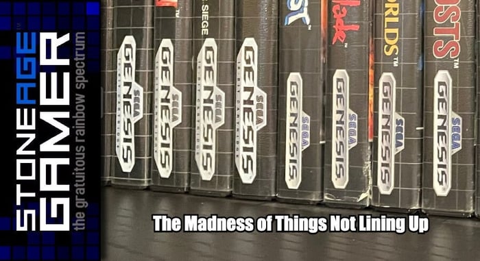
Here's one more for the road. Even before they established that cool stripe pattern, Sega had this excellent grid presentation going on. It looked terrible on Master System games, but changing it to black made it look excellent. HOWEVER, the Genesis logo itself throws the whole thing into chaos. On this shelf alone I have three distinct styles. On the end there’s the huge logo, in the middle there’s the medium logo where they removed the “16-bit Cartridge” wording from the bottom, and then the even smaller version on the end. And that doesn't include the handful of titles that kept the grid but included the barcode on the spine for some insane reason. And oh yeah, one of those games with the barcode is indeed Ecco the Dolphin!
But Wait, There's More!
This is just the surface too. There’s still stuff like when Sony completely altered the way their spines looked a few years into the PlayStation 3’s life, even though they successfully maintained uniformity with both the PlayStation and PlayStation 2 for the entirety of their extensive lifespans, and let’s not forget when Sega decided Dreamcast spines were going to be black instead of white halfway through its life because of reasons.
I fully understand that for most people this is a non-issue. It’s enough to just have their games on the shelf in alphabetical order, and in all honesty I’m happy for them. I’m genuinely glad these little details don't drive them crazy the way they do me, but it always makes me wonder, why were things done this way? Why are there so many examples of things almost matching but not quite hitting that uniform look that makes games so visually appealing on the shelf? The good news is, we have a solution to this problem in the form of BitBoxes, so at least there's that.
What box art stuff drives you crazy?