Pamphlet Power Vol. 2
Pamphlets Playing with Super Power
Welcome back! We’re moving backwards a little today, to the dead center of the Nintendo/Sega console wars. These were fun times, and watching Nintendo try their best to seem like the cool kids on the block next to Sega’s innate cool factor was pretty interesting.
In case you missed our last Pamphlet Power article, we’re taking a look at some super cool promotional pamphlets Nintendo used to set up at retailers like Toys R Us. It's been a fun trip so far, but there's still a ton of awesomeness ahead. So let’s get to work, shall we?
The Best Play Here
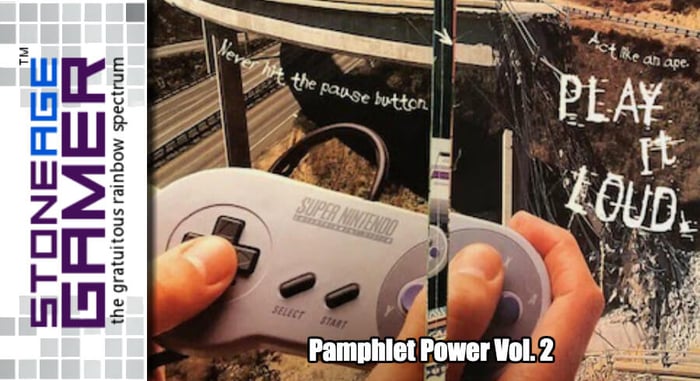
This was Nintendo’s “The Best Play Here” era. It was a little more with the times than "Now You’re Playing with Power," albeit not nearly as memorable. Still, it’s a good slogan, and this bright orange pamphlet was pretty eye catching.
I do like how they put this denim jacket clad kid with a VERY 90s hat on the cover to illustrate what a cool kid looks like, in case you weren’t sure how to properly identify one. But for as “cool” as this all seems, it doesn’t do much to focus on important stuff like, I don't know, actual video games? It's also worth noting that this was labelled as Issue no 1. Neat! Anyway, let’s see where things go from here.
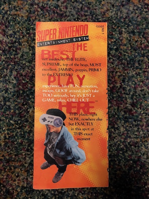
Okay, still no games, but there is a giant… thumbprint? I mean, sure. We use thumbs to play games. I get it. I’m also not so sure how I feel about this whole “elite” thing they have going. It’s bordering on gatekeeping, which kinda sucks. Almost like you have to be good at video games to play Nintendo, and that smells weirdly off brand for them. Does it get any better?
Thankfully, yes. Though not by much. We still aren’t seeing a lot in terms of games, but they are showing us options for buying the SNES and a pair of cool accessories. Other than that, there isn’t much to say here. So let’s see if they can deliver on the inside.
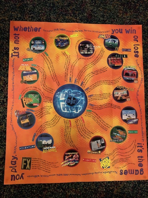
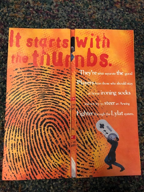
Now we’re talking. This thing is pretty hard to read with the text in all those wacky directions, and relegating the actual screenshots to those tiny little circles takes away from just how pretty some of this stuff really was, but it’s not terrible.
Shining a spotlight on the FX chip and Super Power Club was a good idea for sure. Those were two very Nintendo things, and that's always where they shine the best.
As far as game libraries go, this is pretty darn cool. There’s a smattering of great 3rd party stuff, which is always nice to see on these pamphlets. Street Fighter II Turbo, Star Fox, Zelda, Mario Kart, and even Zelda are all looking top notch here, and I believe everything on display was an exclusive, so good work, guys! I’m particularly fond of the screen shot from Mario All Stars. They killed it with that game’s version of Mario 2, and showing something that colorful is rarely a bad idea.
So, we’re not off to a fantastic start, but it’s not a tragic one either. Let’s see if they can recover with issue no. 2.
Play it Loud
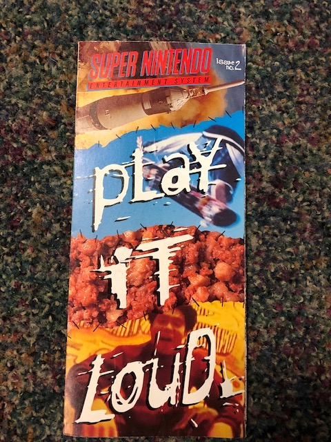
Well, this is certainly colorful! We’re pretty much at the beginning of the Play it Loud period here, and while I can’t say I’m too fond of the close up of the gross ground meat there, it's hard to argue that they more or less nailed the “extreme” aesthetic they were going for. This schtick absolutely worked on me back then, too. I guess I was extra susceptible to this kind of marketing, but man, Nintendo was the pinnacle of cool in my world, which probably says more about my interpretation of “cool” than Nintendo’s. Regardless, I’m glad they eventually got over trying to compete this way, because Nintendo works best when they’re being themselves, but I digress. Back to it.
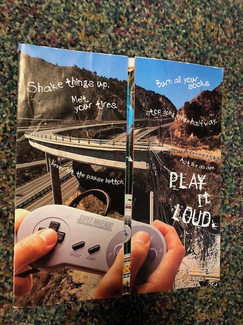
Once you open it up, you still don’t see any actual video games. Instead we have a bunch of “extreme cool” phrases and someone holding a controller near a broken road? Not sure what they’re going for here, but it’s not awful. Let’s hope we see some games soon.
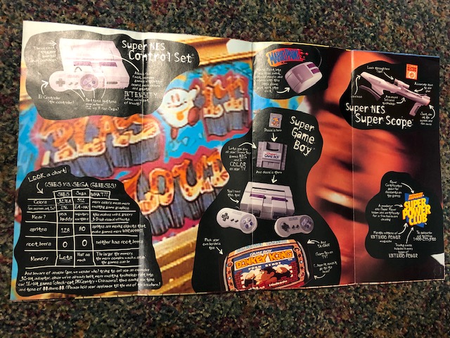
Okay, this is a little better. Spotlighting the system itself and a bunch of accessories is great, and the stat breakdowns for each one are pretty effective. Super Game Boy front and center once again pointing out that the SNES game library can be increased dramatically with the device is smart, as is shining a light on the amazing Donkey Kong for Game Boy.
They did overreach a bit on the “coolness” factor in the background though. This is, I believe, a still image from their Play it Loud TV commercial where a bunch of totally rad kids went around doing extreme stuff while SNES games played. It also included several shots of Nintendo’s mascot characters in various 90s hip hop gear. I’m not sure who thought putting a thick gold chain around Kirby was going to make him look more hip, but they were also probably the kind of person who refers to things as “hip,” so yeah. That’s a swing and a miss there.
But let’s take a close look at this chart in the corner.
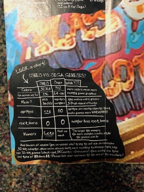
I feel like we don’t see this kind of stuff as much these days, but back in the 16 bit console wars, Ninendo and Sega weren’t afraid to directly call one another out. This chart was exactly the fuel kids needed to argue with their friends over which system was better. It’s actually kind of hilarious in hindsight, and I’m sure Sega had plenty of these kinds of things of their own, but as a Nintendo fanboy, I know this stuff made me feel good! I also like the dig at the 32X at the bottom. Well played.
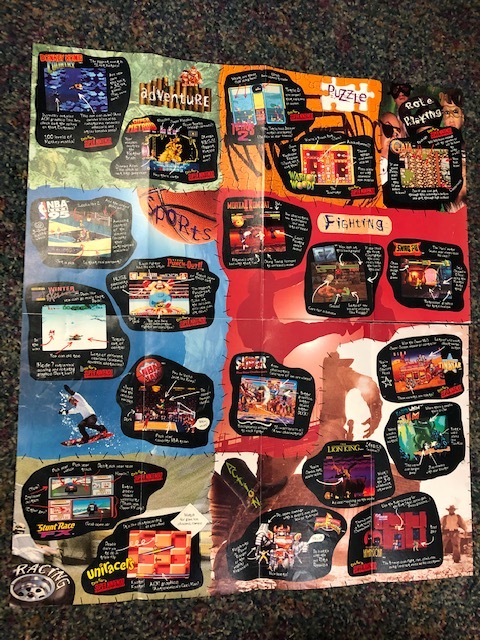
Open this sucker all the way up and wow. Just wow. This is how it’s done, right here. It’s just the right level of colorful to be attractive to pretty much anyone young enough to be into video games at that time. Having it all broken into sections like Sports and Action keeps things organized, and having the “talking points” written all over the screen shots themselves was absurdly effective.
But then, look at how great this game selection was. Adventure is Super Metroid and Donkey Kong Country, two absolute legends in the 16-bit world. Puzzle having representation was also pretty cool, and Tetris 2 and Wario’s Woods are way better games than folks give them credit for, especially their SNES incarnations. Having the PRG section only be Illusion of Gaia is a bit weird considering what the SNES library’s RPG selection looked like by the end of its life, but Gaia is another phenomenal game, and well worth being spotlighted here.
Dedicating that much space to sports was a bold move on Nintendo’s part, since Sega soundly kicked their butt in this department on the regular, but you gotta hand it to them for giving it a solid try. Calling Super Punch-Out!! a sports game is a bit of a stretch, but it makes for quite the eye-catcher so it’s forgivable.
Putting Fighting all big in the middle was a great move, since the SNES was basically the best place to play Street Fighter at home, and they had a lot to prove with Mortal Kombat II after what they did to the original MK. I also love how this one features lots of 3rd party stuff, unlike many of the other pamphlets we’ve looked at before. This paints a great picture of what Nintendo was like before their 3rd party woes, and great versions of stuff like Lion King, Earthworm Jim, and Power Rangers is fantastic.
Finally, the racing section shows off a pair of brilliant games in Uniracers and Stunt Race FX, and anything that shows off TinStar is a winner in my book.
All in all, a vast improvement over Issue 1, and a pretty fantastic pamphlet for the SNES.
So what was going on in the world of Game Boy?
Game Boy "Color"
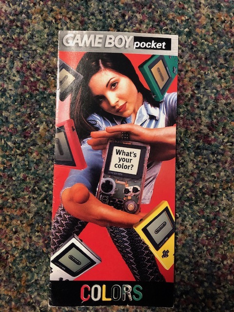
I definitely have a love hate relationship with this particular ad campaign. Really, any of Nintendo’s ad campaigns that revolve around the Game Boy and Color. See, the Game Boy at this point was most definitely NOT in color. Everyone wanted it to be, but Nintendo wasn’t ready to give it to us yet, so instead they made the physical system in color. So all these ads came out talking about how the Game Boy was available in colors now felt like a bit of a stab. That said, having Game Boys in colors was incredibly cool! Let’s see what’s inside.
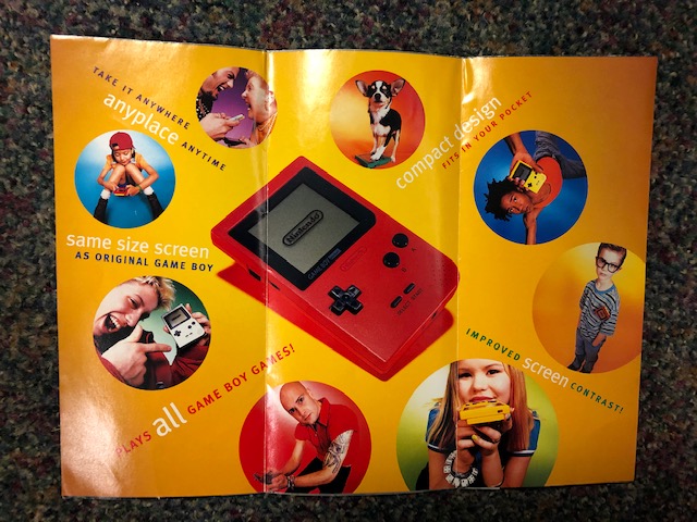
This is a bit smaller than the other ones we’ve looked at. Only three folds. Honestly, the simplicity really works in its favor. This was really all about pointing out how cool the Game Boy Pocket is, and this does a great job of that. Even the “nerdy” kid with one in his shirt pocket is making a killer case for one of these things. So, what games made the spotlight this time around?
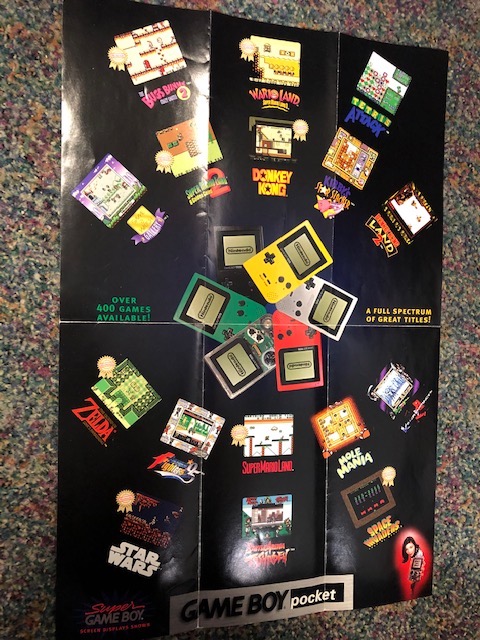
A shocking amount of legacy stuff, actually. Of the 16 games on display here, half of them are actually “Player’s Choice” titles that Nintendo had re-released at a lower price point. The remaining titles are… certainly interesting choices.
Fighting games were never the Game Boy’s forte, but this shows off King of Fighters 95, Killer Instinct, and Battle Arena Toshinden. Admittedly, these are surprisingly playable versions of these three games, so I guess I can see the merit in showing them off a bit. Nice to see Mole Mania on display too.
That’s going to about wrap it up for us today. Come back in 2 weeks when we’ll finish things off with the last of Nintendo’s awesome pamphlets (that I actually have), focusing on the Nintendo 64, and of course, the Virtual Boy.