Pamphlet Power Vol. 1
Over the past few weeks, we’ve been taking a look back a bunch of the coolest promotional posters companies used to include in their games. I used to line my walls with this stuff, but as cool as they were, they didn’t have anything on Nintendo’s promotional pamphlets.
Over the course of several years, Nintendo consistently placed these amazing-looking pamphlets set out at Toys R Us. They were super effective on me, as every time I picked one up I instantly became enticed to buy as many Nintendo products as I could get my hands on. I still have a bunch of these around, and we’re going to look at them all!
So let’s kick this off with my personal favorite of the bunch. No, I’m afraid it isn’t going to get any better than this, at least from my perspective. That’s not to say there aren’t still a whole lot of absolutely fascinating pamphlets to see, just that this one speaks to me in ways that few other pamphlets ever have before. And if you’ve never been spoken to by a pamphlet, can you truly consider yourself alive?
My absolute favorite period in all of gaming history was the transition between 8 and 16 bit. For as much as I loved NES games and their beautiful sprites, seeing them evolve into the gorgeous works of art the SNES was capable of was incredible. It was during this time that Nintendo was fully supporting 3 different consoles, each with their own strengths.
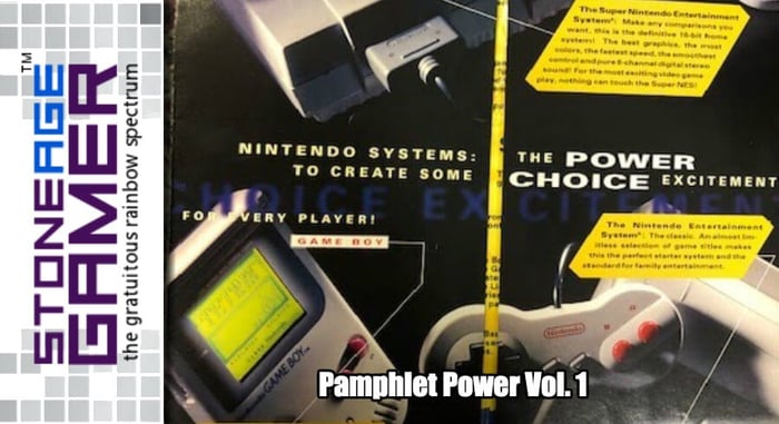
Right off the bat, you have the slick redesigned top loader NES on the end, the worldwide phenomenon of the Game Boy smack dab in the middle, and the future of home console gaming, the Super NES, over to the left. I love how they still have the dynamic lettering at the top for style and cool points, but the rest of the color palate is classy as heck. Those images really make them all not only match stylistically, but make them look like really nice machines. Let’s open this bad boy up, shall we?
The first fold open brings you to an even more stunning glamor shot of Nintendo’s big 3. This does a killer job of breaking down exactly why you would want to spend your hard earned dollars on any one or all three of these things. Again, the lettering is just dynamic enough to entice kids, but the images are so classy if a kid were to take it to their parents, they would at least be given the impression that they were buying some sort of high end electronics and not just some kids toy.
Cracking it open a little further brings us to what basically amounts to Smash Bros. before Smash Bros. Seeing all these Nintendo characters together like this wasn’t the kind of thing you saw every day, and it’s incredibly cool. Personally, I love how stuff like BattleClash and Super Soccer are basically put on the same level as Metroid and Mario. I’m also pretty fond of how Link is there, but the rest of the Zelda representation is a bunch of random NPCs. Like, “Oh hey, it’s the shopkeeper from the instruction manual! Neat!”
Folding it all the way open brings you to one of two different outcomes. They’re both similar designs, but they highlight different sets of games. The top one here is the original one, and I love this lineup. Showing off the number of titles available is also kind of hilarious in hindsight. In a world of digital shops, having these numbers would be sort of silly today, but at the time, it really was impressive.
So this was when Star Fox and the Super FX Chip were the jewels in the SNES crown, and you can tell they were trying to go hard against Sega with it and 3D gaming in general. Star Fox is right there at the top, looking all futuristic and awesome, and it’s followed by NHL Stanley Cup, which was another fairly impressive-looking game (for the time).
With Sega absolutely killing it on the sports game front, Nintendo really put some effort into making their own games into something special. With Stanley Cup and NCAA Basketball (also pictured) they used this wacky mode 7 visual style to make the games actually play out in 3D, albeit fairly choppy, but they made for an impressive visual. I’m not sure sticking Super Play Action Football, a rather forgettable launch title, in the lineup was the best use of space, but it’s pretty tiny, so whatever.
You also have Link to the Past still being sold and spotlighted, and Falcon’s Revenge to keep the Super Scope alive. All in all, it’s a pretty nice-looking lineup, if a little sports heavy for my taste.
The Game Boy lineup is understandably smaller than the rest, what with the visuals not being anywhere near as impressive as anything else up there, but still, there’s Mario, Metroid, and Zelda right in a row. The Game Boy was such a great system.
Then we cap it of with Nintendo pushing their new $50 top loader NES, and this is a pretty great way to do that without diving into the 3rd party stuff. Kirby's Adventure was still relatively new at that point and a technical showpiece for what the NES could do, Super Mario Bros. 3 was still the best selling game of all time, and the rest of the games up there are all-time classics, even then.
When we got to the second iteration of this poster, the lineup looked a little more refined. The numbers had been boosted a bit, which I think made for a more impressive brag, and it seemed like they put the games in a better order this time.
Kicking off with the insanely impressive Super Metroid is always the right thing to do, but then they followed it up with 3 ports games in a row. This time they replaced Super Play Action with the first in their Ken Griffey baseball line, which makes for a much prettier picture. Then they hit us with two of their specialty pieces in the tragically underrated Stunt Race FX and kept the Super Scope alive once again with Yoshi’s Safari, and ended the SNES train with the delectable Super Mario All-Stars.
Again, a little sports heavy for my tastes, but pretty nice. It’s one fewer game this time around, but that lets the Game Boy stuff shine a little more.
And that’s a good thing because even with a complete lack of Zelda on the poster, the Game Boy lineup is still stellar. I like how they were really going hard with Metroid at this point. They knew how impressive Super Metroid was, so they kept Metroid II in the Game Boy section and added the original Metroid to the NES lineup. Tetris 2 and Yoshi’s Cookie were smart choices because the Game Boy was known for its great puzzle games, and then there’s Donkey Kong, Kirby’s Pinball Land and Wario Land, all not just fantastic-looking games by Game Boy standards, but fantastic games in their own right.
Then we get to the NES stuff, and while the game lineup is spectacular, the screenshots they chose are a little baffling. Punch-Out!!, Mario 2, NES Open, and Mario 3 look great. Kirby’s Adventure looks pretty solid too, though there were more impressive places to show off in the game. Metroid looks… like Metroid, which was a pretty darn old game by that point, but they could have shown off the purple bubble area in Norfair or something more than Samus getting an item.
Next we have the Nintendo-published Mega Man 6, and I don’t know if you’ve played that game, but it’s got some really impressive visuals in it. They must have chosen the single most bland image they could have possibly taken. What about the sunset in Tomahawk Man’s stage? The battle with Knight Man? There are so many better options!
Finally, we have the also tragically underrated Zoda’s Revenge, and while this image isn’t the best, I think I get why they used it. For whatever reason, this game's branding really seemed to hide the fact that it was the sequel to Star Tropics, and I think this branch of the marketing department was trying to show this boss fight (which was a callback to the first boss fight in the original game) to shine a light on the game’s lineage. It didn’t work because as far as I know this game didn’t exactly sell well, but it is what it is, I suppose.
Okay, that’s enough of these. Let’s move onto something a bit more colorful.
So, here we are again with Nintendo ditching their classy electronics/kid friendly image in favor of some good old fashioned Sega-competition fueled “cool.” This pamphlet comes a little bit later than some of the stuff we’re going to be looking at in a few weeks, but those actually fit together, so we’re time jumping a bit to the end of their Play it Loud period.
This one focuses on Super NES and Game Boy, which was what Nintendo was using to stave off the next generation for as long as possible. After Donkey Kong Country pretty much blew up the world, Nintendo had found themselves in the enviable position of not desperately needing to launch their new hardware to compete with Sega and newcomer Sony. Nintendo’s always been good at finding success with inferior hardware, and this pamphlet really illustrates that perfectly.
As you can see, they weren’t trying to skirt the issue in the least. “No new system required” indeed, and Rare’s work is front and center. Crazy to think their IPs were so important to them at this time, but they had no problem selling them off to Microsoft when push came to shove. Anyway, let’s see what else we have here.
The multi-sized label maker font is definitely designed to make these things look edgy, and it honestly works. I remember thinking this stuff looked incredibly cool back then, and I’m not going to lie, I still prefer pixel art to 32-bit polygons, so this was directly up my alley.
I also love how the Super Game Boy was front and center here. Adding the Game Boy’s library to the SNES’s was a stroke of genius, and really made Nintendo’s systems feel like they had a level of synergy.
Then we’ve got the Play it Loud Game Boy systems, dressing up that ancient technology somehow making it seem more enticing. The weird thing was that it worked. I bought my first Game Boy during this period, and it was the red one. I felt like a sucker when the Pocket came out shortly after though.
There’s also the Super Scope and Mario Paint mouse, which I love how they were keeping those things alive even at this point. Okay, let’s see the main spread.
Try and beat this? Well, while I can honestly say that I think some of the earlier pamphlets beat this lineup without breaking a sweat, at least in terms of diversity, that doesn’t change how freaking great these games are, especially at the top.
Both Donkey Kong Countries, Killer Instinct, and Yoshi’s Island are all absolute technical showpieces for the SNES. Then they cap it off with Illusion of Gaia and EarthBound, two games that wouldn’t do big numbers back in their heyday, but would go on to be considered cult classics down the road. Does this show off the actual depth of the SNES catalog? Not by a longshot. Does it show off some cool stuff you couldn’t do on a PlayStation at the time? Absolutely.
The bottom part is a bit more lackluster though. Pokemon hadn’t happened yet, but the Game Boy was still a fairly powerful brand. I’m not sure dedicating this much space to stuff like Killer Instinct and Street Fighter II was such a good idea. In theory, having those games portably at that time was amazing. In practice, neither of those games works particularly well on the Game Boy so…
There’s also a surprising amount of focus on these arcade classics titles. I suppose having some of the all time greats on the go was still pretty novel back then, but still, it seems like this real estate would have been better served with more SNES titles. At least Kirby and Donkey Kong Land got a moment to shine.
And we’re going to call it there for today. Check back in 2 weeks when we’ll take a look at the final Super NES pamphlets, and a super cool Game Boy one too! And while we’re here, have these pamphlets done their job and made you want to play Nintendo games? We can help you with that. Stone Age Gamer has an array of flash carts that play all sorts of games from yesteryear on original hardware without the need for replication. Have a look!
