Feeling Board: The Donkey Kong Board Game
Kris Randazzo
February 6th, 2019
7 minute read
The last two times I wrote one of these, the games in question were weird, but ultimately fun. Pac-Man involved a ton of setup and the pieces had creepy teeth, but the novelty of the pieces actually eating the dots made up for it. Centipede was a bonkers concept to begin with, but turned out to be a blast. But today we have Donkey Kong and… ugh…

Of all the classic arcade games out there to turn into board games, I kinda feel like Donkey Kong should have been the easiest to adapt. You could basically just make a variation of Chutes & Ladders and you’re good to go. A few simple hazards, climbing ladders, first one to make it to the top wins the game. Good times. Well, unfortunately for us all, whoever designed this mess of a board game didn’t see things that way. On one hand, they overthought things way too much, and then on the other hand underthought the rest. The resulting experience is a boring slog of a game that shouldn’t be played by anyone, regardless of its cool collector’s value.
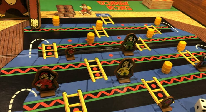
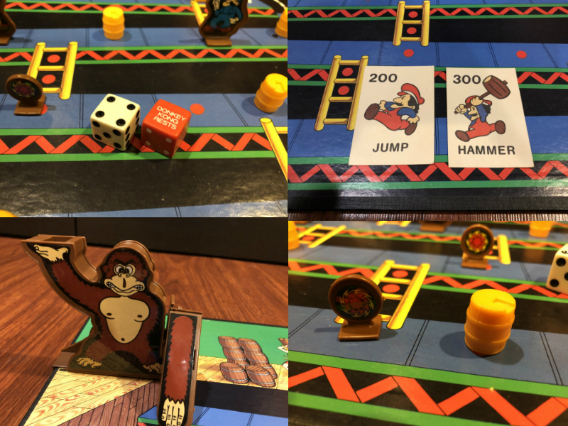
This is another one of the games I got in my yard sale find from a few years back. It’s in pretty nice shape, but it’s missing the instructions, so I had to look them up online. I’m not sure if it was just the instructions I was looking at online, or even if I got them right when my son and I played, but as far as I can tell, this game is absurdly complicated, as is setting the whole affair up. It’s not exactly “placing 72 marbles” complicated, but it’s not terribly far off. You’ve got the game board, which is modelled after the first stage in the arcade game, except the coloring is all weird. Instead of the pink/purple girders we all know and love, this game paints them as blue girders with red and green lines on the side. It’s true that in some of the official Donkey Kong art the girders are blue with just the pink part on the sides, but it’s the addition of the green to them that’s just a little off-putting to me. An odd choice to be sure. The player pieces are four different colored Marios, which I guess makes sense. It’s not like Luigi, Wario, and the rest of the Mario gang had been established at this point. Then there’s a bunch of barrels, which look cool, but wound up annoying the crap out of me by the time I was done playing. (More on that in a bit). And finally, a couple of fireball pieces, a pair of dice, one red with words on it and one regular white one, and a stack of cards with point values and Mario performing various actions. Typical board game fare. That is, until you get to Kong.
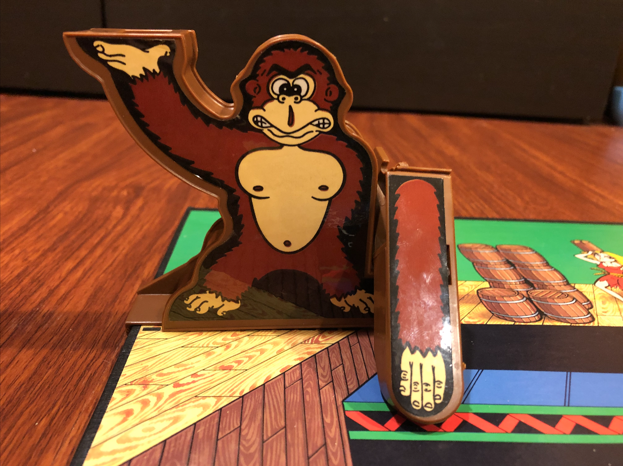
I started to realize that this game might not be very much fun once I started putting this wacky Kong contraption together. This device snaps together and you load him up with barrels. His arm is spring loaded (well, mine isn’t because the spring seems to be missing) and that seems like it’s going to be pretty cool until you realize this elaborate mess of engineering is nothing more than eye candy and a great place to get your barrel pieces stuck. You press his arm down to lay a new barrel, but at least for me, loading the darn thing is really easy to screw up. If the barrels go in on an angle, DK gets all clogged up and you have to pry him apart to straighten the barrels out. If DK actually did something important, this might actually be worth it, but he turns out to basically be this game’s version of ROB for NES. If you take him away, the game is exactly the same, but faster because you don't have to deal with this dumb contraption to place the barrels. He does have this little clip on the bottom of his foot to fasten him to the board, so that’s a nice, thoughtful little touch, but beyond that there really isn’t much about this part of the game that I would consider “good.” He’s ugly, looks ridiculous with his spring-loaded arm, and serves no real purpose.
Alright, enough complaining about the stupid Kong thing. Let’s get to the meat of the game. Each player controls their own Mario. You roll both dice, with the white one telling you how many spaces you can move Mario, and the red one telling you how many spaces to move ALL OF THE HAZARDS ON THE BOARD. Again, I could have been reading the instructions wrong, but I’m pretty sure I didn’t. Every turn, you have to move every fireball and barrel however many spaces you roll on the red dice. If that doesn’t sound like fun, it’s because it isn’t. It’s the opposite of fun. It’s painfully bland monotony designed to simulate the constant movement of the Donkey Kong arcade game. You can play cards to jump over or destroy the barrels as you encounter them, and if I’m being honest, this is pretty much where I started to tune out. Trying to get my 5-year old son to move 13 barrel pieces after every one of his turns was simply impossible, and I in no way blame him for not wanting to do it. That’s not fun at any age, and it goes to what I said earlier about the creators overthinking things. This didn’t have to be this complicated.
Centipede and Pac-Man worked because they looked at the elements of the arcade games they were based on and figured out how to adapt them into a board game sensibly. In the case of Donkey Kong, it seems like they looked at the arcade game and instead of trying to build a board game around that, they just took it as literally as possible. They wanted to find a way to make DK throw barrels, and keep the board in constant movement. It’s almost a good idea on paper, but the thing they completely forgot to take into consideration when designing it was whether or not it was actually a fun game to play.
In case you can’t tell, it isn’t.
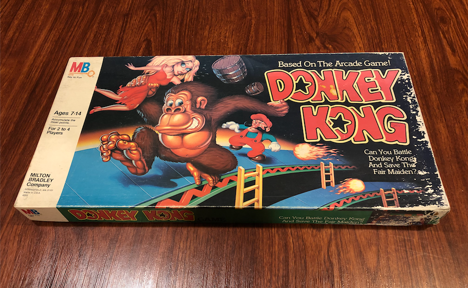
It’s not all bad though. For one, the artwork in this game is pretty cool. Yeah, the girders look weird, but everything else is based on actual Donkey Kong artwork, and very little of strikes me as “off brand” if you know what I mean. There aren’t any Pac-Man pieces with creepy sharp teeth here. Everything looks like it more or less fits in with the arcade games’ art aesthetic, and that has to count for something, right? The actual game box is pretty nice as well. It’s basically a detailed painted version of the original’s official art, which is nice, albeit a little eerie with this level of detail. Milton Bradley also used this art for a 200 piece puzzle, but I think this game and that puzzle are the only places I’ve seen this specific artwork before, so that’s pretty cool.
I wish I had more nice things to say about it than this, but I just don’t this game is dreadful. It’s poorly thought out, barely resembles fun, and leaves tons of potential on the table. I have no doubt Donkey Kong could have made for a heck of a cool board game, but they really dropped the ball with this one. Here’s hoping the next one is a step up.
Related Articles
SAG Episode 240: Geekade’s 2018 State of the Gaming Union
1 minute read
February 8th, 2019
SAG Episode 239: Uncle Ben Stays Dead
1 minute read
February 1st, 2019
Internet Times Have Changed
13 minute read
February 13th, 2019
The Metroid Void
8 minute read
January 30th, 2019

