Is There a "Right Way" to Remake Games?
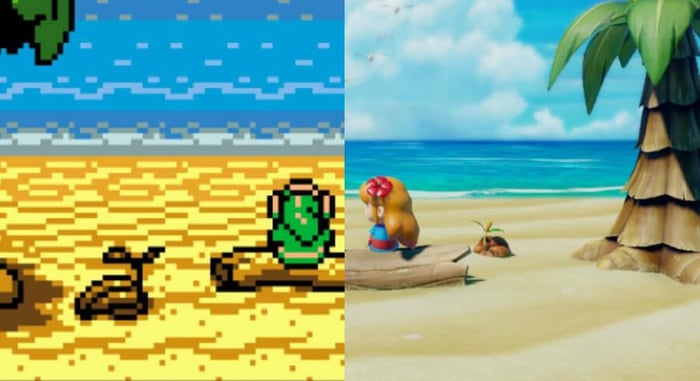
With Link’s Awakening out, I keep seeing folks say things to the effect of “This is the right way to remake a game.” While I find the new version of Link’s Awakening positively enchanting, I don’t know that I agree with the sentiment.
Remaking games, particularly retro games, can be a very complicated process because so much of old games is up for interpretation. Older sprites, particularly on 8-bit hardware or older, can look like completely different things to different people. Looking at the original Game Boy version of Link’s Awakening, you can see how the remake landed where it did. When looking at the two side by side, the connective tissue between them is obvious. But with how the player’s own imagination plays a significant role in how old games are experienced, backlash to the game’s art direction is more meaningful and arguably valid than the initial hatred leveled at, say Wind Waker when it was revealed. I personally never imagined Link’s Awakening as a bunch of shiny toy-like people running around, but having played this new version it’s almost amazing that I didn’t. Even following the gorgeous animated intro, which the first time I saw back when the game was announced was what I thought the whole game should have looked like, the final art direction is stellar. I never would have arrived there on my own, though, and for as much as I like the game, I can’t help but feel a slight thread of disappointment because this look is not at all what I had imagined. In my mind, if Link’s Awakening were ever to be remade, I would have wanted it to somehow look like the art in the instruction manual. I would have had the music play out with more acoustic string instruments than toy pianos, because when I imagined what the artistic intent of the original sprites and chiptunes were, that’s what came to mind. Clearly, the folks at Nintendo and Grezzo had other thoughts, and this is definitely not the first time something like this has happened.
Take Super Mario All-Stars for example. In case you don’t actually know what Super Mario All-Stars is, it’s a 16-bit Super NES remake of the first 3 NES Super Mario Bros. games. Super Mario Bros. 2 and 3 were pretty straightforward upgrades in the game, but Super Mario Bros. basically had to be visually reinvented since the original graphics were incredibly primitive. In the process of updating the visuals, they also added a degree of context to some of the stages that while I found completely fascinating, didn’t exactly line up with what was in my imagination. Look at the classic level 1-2.
I honestly couldn’t tell you specifically what I thought this stage was supposed to be, but I can say that I always took its visuals pretty literally. I never really imagined there was much besides endless black in the background. But then Super Mario All-stars came out and the stage looked like this.
I knew the stage was underground, but I never imagined a mine. This stage has lanterns in the background and wooden supports all over the place. There are rocks with plant life growing on them, and a crazy cool echo effect added to all of the sound. It looks and sounds fantastic, and it changed my perception of the level even when I go back and play the original.
But this was just 8-bit to 16-bit. In most cases of remakes back then, the gap there wasn’t so astronomical that radical reinventions were even all that possible. Super Mario Bros. up there isn’t unrecognizable, even though the changes were pretty considerable. But now that the goal posts of graphical limitations are so much further away, reinventions can be far more ambitious, but also risky. Take one of the, in my opinion, absolute best remakes ever, Wonder Boy: The Dragon’s Trap. The original game is, visually speaking, just as sparse as something like the original Super Mario Bros. Okay, maybe more like Zelda II than Super Mario Bros., but still pretty barren. Not necessarily for the time, but by today’s standards, not a graphical powerhouse. Some background detail like a couple of trees here and there, and level design that works for classic games, but doesn’t make much sense when applied practically.
My imagination was never really set on fire when wandering through this game’s world, but it was easy enough to picture the world these visuals were painting. I’d imagine walking past the outskirts of a well trimmed forest, maybe heading toward a castle since all the trees are neatly aligned in a row. Once you pass this area you find yourself in the depths of a dark forest, which again makes a degree of sense considering the trees in the background, but there was no part of my brain that could have possibly prepared me for what the absolute wizards at Lizardcube came up with.

That’s the same area. And they applied this kind of stunning imagination to basically the entire game. In the original, there are some background elements, but the actual gameplay area is just flat ground with those weird glowy orbs and that sunglasses-wearing cloud chasing after you. In a million years I never could have imagined that area looking like this, but it’s incredible. Not only is the art direction stellar, but they added a layer of mythology to the whole world by adding the giant statue. There’s a graveyard, a field of brown grass, and so very much character. In the original game, the sky gradually gets darker as you get closer to the forest, but these guys added this jaw dropping sunset to the background. It’s freaking nuts, and really elevates the original game. It’s not what I imagined, but like Mario All-Stars, this is actually better than what I had in my head, so big win all around.
On the opposite side of the spectrum, you have something like D/Generation HD. This is a game that, to my eyes, completely ignores what made the original game special and turns it into a relatively generic action/puzzle game. I can think of a dozen remake options for D/Generation, but this bland version was never one of them.
But enough of that. Let’s turn our attention to something a little more divisive, Mega Man: Powered Up for PSP. This game was designed to be as much a reboot as it was a remake, and all in all is a very good Mega Man game. The trouble is, its style was dramatically altered from what the original series was known for, and the game got panned for it. The art style for the original Mega Man series had evolved into something quite nice by the time it hit Mega Man 7. It arguably went a little too far into anime territory for Mega Man 8, but still, Mega Man had a defined look and there wasn’t anything wrong with it. For this remake of his very first outing, the entire world became chibi-fied, and that turned a LOT of people off. The level designs and updated environmental visuals were great, the ability to play as the robot masters was (and still is) remarkably cool, and there’s even some pretty decent voice acting. But this new vision for what Mega Man and his friends/enemies looked like didn’t just set itself at odds with what the modern Mega Man games had become, but what most people always thought Mega Man was supposed to look like as well. This carried over to the music too, which leads to another very dangerous but ultimately important part of remakes.
The music in Mega Man: Powered Up was almost entirely reimaginings of the original NES game's tunes. The difference here was that most of the minor notes were turned into major ones. If you aren’t really into musical lingo, basically they took a lot of the sinister sounding songs and made them sound really happy. For example, here’s the original version of Guts Man’s stage.
And here’s the new happy version used in Powered Up
Truth be told, I absolutely friggin love this new version of this song. I really like Powered Up in its entirety. Yeah, I could have done without the chibi art direction, but it’s a really great game. That said, I completely understand why some folks would gravitate away from its new music because it really changes the original artistic intent of the songs. Bizarre instrument choices are one thing (I’m looking at you, Ninja Gaiden Trilogy), but changing a song’s overall style is a bold move, and while it worked on me, it really put off a lot of others, and probably contributed in no small part to this game’s overall failure to find an audience.
Moving back to wonder Boy, though, there we have an example of taking an original 8-bit song and altering its style to such a spectacular effect that it almost becomes unrecognizeable as the same song. The field shot from above was originally set to this music.
And the remake’s version sounds like this. Buckle in because it’s quite an impressive reimagining, especially around the 1:30 mark.
In certain circles, this game’s soundtrack is nothing short of legendary, so taking on these songs in a new light was always going to be a daunting task. In this case, I think it’s fair to say these folks succeeded in spectacular fashion, but it was still an incredible risk. DuckTales Remastered, Secret of Monkey Island: Special Edition, and countless others have had their soundtracks ripped to shreds by people who didn’t care for the new directions on some of the tracks, and that can be a difficult thing to say someone is definitely wrong about. After all, it's all subjective.
Bringing it back to Link’s Awakening, a common criticism of the game is that the music doesn’t sound like many had been imagined it to, especially in light of the Zelda Symphony of the Goddess recordings floating around out there. While I certainly don’t feel the sweeping orchestral versions of that concert would necessarily work in Link’s Awakening, I have come across a few tunes that don’t line up with what I imagined a more full version would. For example, this is one of the tunes from Link’s Awakening that’s really stuck with me over the years. It’s what plays when you enter someone’s house.
It’s very simple, very calm, and very reserved. It’s a light sound, and it evokes a very specific feeling of peace and calm whenever I hear it. In the remake, this is how it sounds.
Now, I understand that this game takes place on an island, but I never imagined this tune sounding so tropical. This instrument choice gives this song a feeling that’s so far removed from how the original affects me personally, it’s honestly hard to listen to. The composition is identical, but making it sound so tropical changes the feel completely… for me. But that's just it. It changes the feel for me, not everyone.
This will always be a problem with remakes because there’s just no way to be all things to all people. Sometimes you don’t improve enough like Ocarina of Time 3D or Earthworm Jim HD, and sometimes you change too much like in Crystalis for Game Boy Color or Conker: Live and Reloaded. Sometimes you get the visuals right and completely botch the music like the Secret of Mana remake, and sometimes two different developers take a remake in two wildly different directions like AM2R and Metroid: Samus Returns, with both pleasing fans for different reasons. It’s impossible to truly understand what makes a classic game special because that might be something different to everybody. I’ve complained about the Final Fantasy VII remake a ton of times on the podcast, but I’ve come around to rethinking my position because what’s special to me about Final Fantasy VII isn’t necessarily what’s special to everyone else. I feel like the original gameplay should be kept intact, but for many it was less that and more the visual storytelling aspect of the game that made it so endearing.
So what’s the answer? No, I don’t think there’s a “right way” to remake games. The closest thing to “right” I can think of is to put the right amount of effort into it and commit to your vision. It will probably always be divisive, but quality is quality, and people tend to gravitate to quality games… eventually if not immediately.
What do you think? What are your favorite and least favorite remakes and why?


