Another 3rd Party Poster Party
Kris Randazzo
March 18th, 2020
8 minute read
It's party time, again!
Last week, we saw some of the best 3rd parties on the NES try to convince you to invest in their product lines via flashy posters. This week we’re looking at something similar, but not quite the same. Today’s games aren’t all-time classics, but they are still interesting studies in marketing design. Let’s kick off with a publisher everyone has fond memories of, Hi-Tech Expressions.
More like Hi-Tech Expressionless
If you’re like me, you probably don’t have a ton of fond memories of Hi-Tech Expressions games. Unlike Capcom, Konami, and countless other 3rd parties, Hi-Tech Expressions didn’t leave much of an impression on the youth of America. Their lineup seemed to consist of a bunch of game shows, which admittedly isn’t the worst thing in the world, but it does make their game lineup look a bit more frazzled than diverse.
The top row is Chessmaster and Hunt for Red October, both brands that don’t exactly scream “cool!” Then there’s three game shows and an intensely strange-looking Muppet game. Then they finish things off with a pair of Sesame Street games. And sure, these games aren’t actually bad, but they don’t really leave a lasting impression.
The posters design doesn’t make things much better either. Gradient orange isn’t inherently bad, but it’s not doing anyone any favors here.
I suppose it’s kind of cool that they nabbed the muppet license and really put a focus on their Sesame Street stuff. Kids need video games to teach them the alphabet after all, but I don’t imagine many people’s favorite Nintendo game is on this poster.
“Super” is a matter of perspective
Let’s turn our attention to Virgin Games. These guys made a bit of a splash for a while with their licensed stuff, but have since gotten away from the video game world. Fun fact: There’s a mobile game branch of Virgin these days, but it’s unrelated to this company.
Anyway, the content here might not be spectacular, but this is a much more dynamic design than what Hi-Tech Expressions was rocking. Images are staggered, screen shots and box art look cool, there are even some fun splashes of color on there. Then again, aside from Silver Surfer and Robin Hood, there isn’t much here for kids to get excited about. Spot on NES is more of a bland puzzler than the cool action platformer Virgin released on the SNES and Genesis, and kids aren’t usually lining up for titles like Golf Power and Caesar’s Palace.
There’s a case to be made for diversity, and the poster calls attention to that, but ehh...
Because “Fujisankei Communications International” doesn’t exactly roll off the tongue
Of course, then we have these guys. FCI is another classic publisher nobody really remembers, and with this lineup it isn’t hard to tell why. Unless you’re really into console ports of PC RPGs, there isn’t a ton here. That and, wow. Were graphic designers that hard to find in the 90s?
Regardless, these aren’t bad games. Ultima can be a good time, and Out of Gas for Game Boy is a genuinely cool little game. But this reads like a boring catalog with bullet points and everything. Where’s the style?
Being into fun and games doesn’t mean you make fun games
GameTek, on the other hand, has style! Unfortunately, they don’t have any games to go with it. The poster on the left cracks me up because they only have 2 actual games there. They seem to be trying to build a brand on just two game show conversions. Admittedly, they’re two of the biggest names in game shows, but the only other stuff on here is the promise of more in the future. It really smells to me like they jumped the gun.
It wasn’t long before they made a revised version with some more actual games people could buy on it. Hollywood Squares is indeed a real live game that was sold in stores, but Password and The Price is Right failed to materialize. Instead, they kept making Jeopardy and Wheel of Fortune games, and Double Dare. Sorry GameTek, that’s not going to be enough. Cool looking poster, though.
The Jaleco Junk
Now we come to Jaleco, which is a brand we still see around from time to time. A few of their games are even on Nintendo Switch Online right now. This is also the first double sided poster we’ve come across today.
Really, it’s a great looking design. They were clearly proud of getting that Young Indiana Jones Chronicles license because the whole poster is themed around “adventure,” even the parts that don’t really make much sense. Rampart, King Arthur’s World, and Utopia aren’t all time classics, but they leave a good impression, and they’re relatively on-theme. Let’s check out the back
Not so much. This is a little more spastic, but nonsensical adventure theme aside, it’s still a nice set of games. Arcade classics on the go we’re still a relatively novel thing, so Q*Bert is a cool get, and their sports brands Goal and Bases Loaded actually carried some clout back then. I’m personally a big fan of Super Bases Loaded. Go Atlanta Amoebas!
Yes, it’s weird that it stylistically matches the adventure theme from the other side, but all in all it’s a pretty cool poster. Well done Jaleco.
Attack of LJN!!!
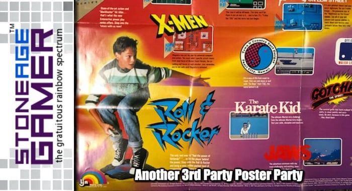
Now here we have a poster that brings with it mixed emotions. It’s easily the coolest looking one so far, but it’s also for LJN.
If you’re familiar with their work, it will come as no surprise that here are some real stinkers on this poster right here. Roger Rabbit and X-Men stick out to me as particularly awful games, but they are balanced out by stuff like the genuinely fun to play Jaws, and merely mediocre games like The Karate Kid and Friday the 13th.
The real star of the show here though, is the Rock & Roller. Just look at that stupid thing and the totally rad kid having a blast riding it.
I have a Rock & Roller. Nothing about it is anywhere near that fun.
From Board Games to Video Games
Meanwhile, Milton Bradley decided to take a detour from making board games based on video games to selling just video games themselves. They were clearly very proud of getting EPYX’s California Games, and I do remember it being a big deal back then, but did they really need to highlight it twice? Probably yes, since I don’t think they had any other games to promote yet.
It’s also worth looking at Marble Madness because that game rules. I’ve never played World Games, so that one’s a wash, but that’s it. Three games, and they made a poster. Seems like a low number to me.
Design wise, it’s eye catching, but ultimately only effective in promoting California Games. And honestly, I’d rather play the Atari 2600 version. That BMX game ruled.
Is that a Lion Fish?
Finally, we come to Bullet Proof Software. This company baffles me a bit because they didn’t just want you to stick with their lineup of games, they thought people would like them so much they’d hang up a poster with just their logo on it.
Which, okay, it’s a pretty neat logo, but does anyone even remember Bullet Proof Software as anything more than a footnote and some Tetris sequels? Let’s flip it over and look at the games, shall we?
Okay, there’s a whole 3 games on this poster, too. It’s a double sided poster with their logo on one side, and exactly 3 titles on the back. I don’t know much about Obitus. Spike McFang is a pretty awesome little game, and Yoshi’s Cookie is a killer puzzler. But really? Not only is the lineup anemic, but why not use any actual character art here? You had an opportunity to put Yoshi on there, and you didn’t take it?
Maybe they didn’t have the rights to use the character in their promotions, but that seems unlikely to me.
Seriously though, go play Spike McFang. It’s great.
And that’s going to do it for 3rd party posters, but the coolest stuff is yet to come. Next week we’ll look at some of the Nintendo posters I found and they’re super cool.
In the meantime, do you have any fond memories of these games? Because if you’re looking to play them again, we can help with that. Our line of flash carts make playing your old games super easy. Then you can try Spike McFang! See you next week.
Related Articles

COVID-19
1 minute read
March 16th, 2020
SAG Episode 298: I'm Out for Blood
1 minute read
March 20th, 2020
SAG Episode 297: I Have Scrooge McDuck in Puzzle & Dragons
1 minute read
March 13th, 2020
A 3rd Party Poster Party
10 minute read
March 11th, 2020


