The "Box Within a Box" Problem
Kris Randazzo
May 19th, 2021
7 minute read
A Box So Nice, They Used it Twice
I’ve always been a big fan of video game box art. Getting my start with the Atari 2600, it’s easy to see why. Those original Atari games had the coolest box art I’ve ever seen, and trips to the mall, and even the game catalogs, would set my imagination on fire.
Even bad box art is a source of interest. The original Mega Man for NES, while terribly inaccurate, was still a fascinating drawing full of weird imagery. Or how about Phalanx with some old guy playing the banjo on the cover, or some of those old Pac-Man releases for home computers? It all has its place, and it all brings me some level of joy.
However, there’s one sort of box art I’ve never really gotten the hang of, and that’s the “box within a box” style. You know what I’m talking about, it’s the box that shows you a picture of a product that has original artwork on it instead of just showing off the artwork that was designed to show the product off in the first place. It’s like buying a box of Band-Aids that had a picture of a box of Band-Aids on the front instead of just a picture of Band-Aids. Why not just show me the darn Band-Aids?
This stuff baffles me to an irrational degree, so I’ve put together a short list of “box within a box” releases because, well, why not? Let’s have a look.
Coleco Games
We’ll start off easy because at least with these games I sort of see the point. Back in the early 80s, Coleco published games for Atari 2600, Intellivision, and the like, and they had a particular style they used on their boxes. Have a look.
The prospect of being “arcade perfect” back in the old days was the ultimate selling point. Granted, very few, if any games released during this era managed to accomplish that particular feat, but with these games it was clear Coleco wanted you to believe they took the arcade cabinet and put it in this box.
But it doesn’t really read that way. These games had awesome artwork on their cabinets, like Donkey Kong pictured above, and from a distance, like say from the other side of a counter, you really have to take the time to look for the logo or something instead of being drawn in by some really cool artwork. This just reads like a bunch of text and unless you recognize the Donkey Kong arcade cabinet at that size, there’s a chance you might just gloss over this one. And the red DK logo on the red background isn’t doing anyone any favors.
They did a bunch of these on multiple consoles, and the early Atari 2600 ones are by far the worst offenders. Later, they did at least wise up enough to include some of the original artwork in addition to the arcade cabinet, but no matter how you color it, these weren’t exactly inspiring choices.
The Sega Card
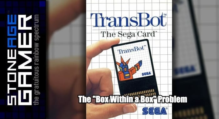
I’m not saying Sega Master System box art was all that good to begin with, but it was at least consistent for the first several years of the console’s life. Then there were the Sega Card releases, games that were on cards instead of cartridges, and I guess Sega through the fact that they were on cards was the biggest selling point because, well, just look at these things.
Did people really buy these because they were on cards? Did people really walk into a store and see the regular version of My Hero on a shelf with the Sega Card version next to it and say “I’m tired of these bulky cartridges. I want my game on this card!” and that was the deciding factor in their purchase?
Don’t get me wrong, the Sega Cards are kind of cool, though they do seem ultimately pointless to me, but if their purpose was to be less expensive, the price tag was really all there needed to be besides just saying it was a Sega Card game on the front of the box somewhere. Putting a picture of a hand holding the card with the cover art on it is just plain silly. It tells me nothing about what the game inside is actually about.
Again, not that Master System cover art was doing much to sell people on the games themselves because man, that stuff isn’t good, but it’s always better than this.
Resident Evil Archives
Like the Coleco ones, these aren’t too terrible, but they aren't great either. I understand the desire to make some sort of collective branding for a series of re-releases like this. You’re taking old Resident Evil games and porting them to a new platform, and you want them to stand out. Sure, that’s fine. But add a banner. Heck, just add some extra words to the title. But don’t do this.
The whole look is just plain confusing, especially with Resident Evil written twice on the same cover. But while this is a bit excessive (I mean, if you’re going to sell Resident Evil on Wii, just sell Resident Evil on Wii. It didn’t really need this extra layer of branding) it at least looks pretty cool. Sure, if you think about it for more than a few seconds the absurdity of the thing becomes way more apparent, but at least it isn’t awful. Would it have been better if they just used that Resident Evil artwork as the actual cover? Absolutely. But then you have what happened to the European version.
Wow. Just wow. Where do you even start with this? I understand that this was the artwork on the GameCube Resident Evil remake, which is itself a tragedy considering how gorgeous that game was, but this is still completely bananas. There’s just nothing to it. The Archives border they created for this line is more interesting than the cover art they plopped in the photo. And why? The US artwork exists, so why do this on purpose? The Resident Evil 0 release didn’t fare any better either, so as silly as we had it in the US, European Wii Resident Evil fans had it worse.
Konami’s Best
And here we have the best of the best. The cream of the crop. The ultimate example of “box within a box” and the pinnacle of thoughtless box design. Behold, Castlevania: Dawn of Sorrow.
In every other instance I’ve been able to see a degree of reason behind their choices. This though, this just defies all sense of logic.
Everything, even the ESRB rating, is duplicated. DS-DS, T for Teen-T for Teen, Konami-Konami. It’s completely ridiculous in every way. Even the Konami’s Best bar at the top with the tiny little “Play it!” written in there is insane. What else are they going to do with it, eat it?
This was the only release in the Konami’s Best line in the US, but there was a similar line in Japan which saw several releases.
These at least make sense to me, as they reuse the original cover art without reusing literally every element so they avoid repetition. My best guess is the Konami’s Best thing was some sort of miscommunication. Someone at Konami was told to put the original box art on the cover and just took that as literally as possible, and then nobody took the time to correct it.
But honestly, why bother with this at all? If there’s going to be a full line, sure. But Dawn of Sorrow was the only one, so why not just print more copies? Why go through the trouble at all?
There must be more out there, but these were the ones that sprang to mind. What do you think of these designs? Do they drive you irrationally mad like they do me, or are you a normal person who can easily ignore these kinds of things? Let us know!
Related Articles
Stock Update: May 2021
4 minute read
May 20th, 2021
Stone Age Gaming - Sega Video Driving System
1 minute read
May 17th, 2021
SAG Episode 359: I Could F*** with Ohio
1 minute read
May 21st, 2021
SAG Podcast Episode 358: Jar Jar's Bizarre Adventure
1 minute read
May 14th, 2021

