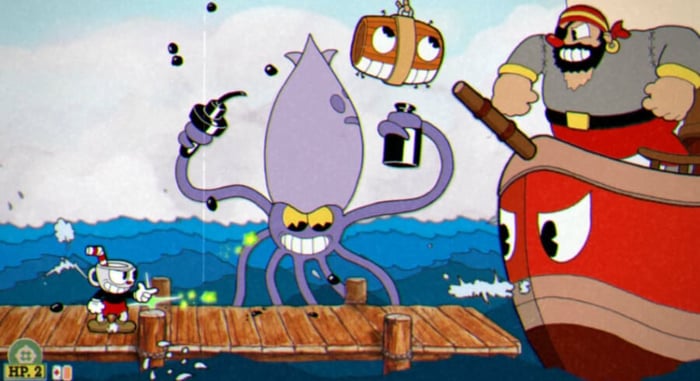
The Animation Situation
Cuphead has hit the Nintendo Switch, and as anticipated, I’m absolutely in love with it. Particularly with the way it looks. The game’s a blast to play, but everything about it is enhanced by its incredible sense of style and the fact that it quite literally looks like a cartoon. Games have strived to perfect that look for a very long time, but in the past few years it’s become apparent that it’s now actually a very attainable goal. Controlling a game that looks like Dragon’s Lair is finally a reality, so why is it so rare?
Particularly good animation has always been a big linchpin for me being impressed by a game’s visuals. Kirby’s Adventure for NES had some killer graphics, but it was the animation of him swinging his sword that really caught my attention. Lemmings walking, SOPHIA III’s wheels turning, Earthworm Jim’s idle animations, smooth movements are just captivating, and really made certain games stand out, especially when compared to the averages of the time. Take Disney’s Aladdin, for example.
I was always a Nintendo guy through and through, and when I saw Aladdin running on Sega Genesis, I couldn’t wait to see what the SNES version was going to look like. Super Nintendo games, to my eyes and ears, pretty much always looked and sounded better than their Sega Genesis counterparts, and I just so happened to also be a HUGE fan of the Aladdin movie. I got it as a gift, furiously ripped it open, and it looked like this…
I was slightly taken aback. Sure, this doesn’t look bad, not by any stretch. But I had seen the Genesis game. While I was playing something that looked very much like a video game, my Sega-leaning friends were playing something that looked like this…
It’s easy to see why I was disappointed. Sega and Virgin Interactive worked with actual Disney animators to make the Genesis version look like you were playing the movie (as best as the technology of the time could do) and the result was captivating. Meanwhile, Capcom just made a video game. Video game sprites, animating like a video game. Again, not bad, but not special either. Aladdin for Genesis showed that games were getting closer to being able to mimic actual animation, and that kept my mind aflutter for years.
I think the next time I was good and truly floored by a game’s animation was Street Fighter III. Once Street Fighter, and really just about all Capcom’s fighters, adopted the animated style popularized in Darkstalkers, I figured that was about as good as it was going to get. Boy was I wrong.
Street Fighter III moved like a Disney movie, and I couldn’t look away. It didn’t hurt that the game played like a dream too, but I could stand there and stare at it all day. The sprites were still a little pixelated, but I don’t think I had ever seen a game move like that before. This was a cartoon I could control, and it once again got me so excited for where 2D video games could potentially be heading.
Unfortunately, very few games actually wound up taking this route. Sprites and hand drawn animation were almost always brushed aside in favor of polygons, or in more recent years, old school pixel art. I don't want to disparage pixel art here. I couldn’t be happier that it’s still a thing these days, and so many indie games I know and love wouldn’t be the games they are if not for the return of pixels. That said, it’s that very indie community that has proven time and time again that making a 2D game 100% literally look like you’re playing a cartoon is not only possible, but remarkably impressive. Take the masterful Wonder Boy: The Dragon’s Trap for example.
The folks at Lizardcube took the frankly ugly Sega Master System original and made the whole game look and sound like an honest to goodness cartoon. Every inch of this game was a complete joy to look at because every inch of it was planned out like a cartoon. The environments, even though they were made up of tiles in the original version, never felt that way in the new version because they were drawn with such a whimsical, organic style. Just look at this game in action.
It’s stunning, not only because it’s animated like a cartoon, but because the art direction makes it feel like one too. Its pseudo sequel Monster Boy and the Cursed Kingdom was a very good game, but it never impressed me even a fraction as much as Dragon’s Trap did because while Monster Boy eventually decided to redraw their characters and animate them in a similar style, the game’s world still moved like Flash animation, and the character designs simply weren’t anywhere near as inspired as what the folks at Lizardcube came up with.
To my eyes there’s just no competition. Dragon’s Trap has the soul of the very best that traditional animation has to offer, and that’s why I’ve played through the remake a handful of times, but I probably won't be going back to Monster Boy anytime soon. Again, I have to stress that Monster Boy is a very good game made by some very talented people, but at the end of the day it felt like it was missing something, especially after having spent time with Dragon’s Trap.
Which again brings me to Cuphead. Talk about a wow factor. I’m not going to go too deep into why I love the game itself, but there are so many visual touches that make it feel like a genuine cartoon, like the way the characters always seem to be dancing, or the way things that can be interacted with are painted differently than the more detailed background elements (something I’ve always been hyper aware of since the Looney Tunes days) are the details that really bring it home.
And again, it’s all about style. Everything in this game is ultra expressive, and it results in a game experience that I can’t be mad at no matter how many times I die trying to beat a boss. It’s just so gosh darn gorgeous!
But enough gushing about existing games. The thing that’s been bugging me, especially since I’ve started playing Cuphead, is why aren’t we getting more games that look like this? Why do we live in a world where this kind of thing is completely doable by an indie studio, but AAA studios won’t go anywhere near? Let’s reel it back in to Capcom for a second.
Mega Man 11 was a weird game. The overall reception was pretty good, and that makes sense. Mega Man 11 was a pretty good game. But Mega Man games have sort of bugged me since the SNES era because for whatever reason, they never tried to deliver on the potential Mega Man’s art style has to offer.
Mega Man 11 isn’t a “bad” looking game, but we have the power to make the actual game look like the image on the left. Can you imagine a Mega Man game with hand drawn animation? Mega Man and a set of Robot Masters running around looking exactly like the super-cool art that has always accompanied the games? Mega Man 7 on SNES took some great steps in that direction, and Mega Man 8 on PSX/Saturn followed suit… sort of.. But lost some of that classic art style in the process. When Mega Man 9 came along, they shifted the character art to the more classic 1-6 look, but made the game itself look like NES titles. Now that Capcom has the tech necessary to go ahead and make Mega Man look like a cartoon, they went with this weird cel shaded look in MM11, and it came out good, but not as great as it could have been.
Sega’s another offender in this arena. Sonic Mania is without a doubt the best Sonic game I’ve played in years, and it did a spectacular job capturing what made Sonic games special in the first place. It was the reset the franchise needed. But as cool as it was to have a brand new 16-bit-ish Sonic game, they kind of spoiled me a bit with those wonderful Sonic CD-style animated cutscenes.
These things are so wonderful, and the new animated shorts they’ve been putting up on YouTube are a real joy to watch. Meanwhile, the game looks like this.
That’s not ugly. In fact, that’s really cool-looking. But why not make the game look like the animated cutscenes? Can you imagine how incredibly awesome it would be to play a 2D Sonic game that looked like that? Because I can, and it’s incredible. Back when Sonic CD came out, it made sense. The animation and the game were never going to match. But they can do it now, and I think they should. Sega is letting Lizardcube make Streets of Rage 4 in their animation style and it looks like a freaking dream. Sonic Mania 2 is almost certainly going to happen someday, and I hope they’re bold enough to try and make the game match the cutscenes, because that would be the coolest thing in the world.
Finally, we have to turn our attention to the biggest offenders of all, Nintendo.
A few months ago, they released a trailer for their Link’s Awakening remake. They started said trailer with this work of art.
A whole animated cutscene in this style. My jaw had set up permanent residence on the floor. This is a world where Cuphead and Wonder Boy: The Dragon’s Trap exist. I really thought for a minute that we were going to get a Zelda game that looked like this. That awesome Zelda artwork finally playable. But...
Like Sonic Mania, I stand by my assertion that this doesn’t look bad. I think it looks pretty great, really. The trouble is, as cool as this is, it’s not even in the same solar system as that animated cutscene up there. I have no doubt that it would have been a heck of a lot more work to make this game in hand drawn sprites instead of polygons, but holy heck it would have been worth it. No small number of Zelda fans have wanted to play a Zelda game that looks like its key art since the 80s and 90s. This was an opportunity to deliver on that and show off something that was truly breathtaking. Link’s Awakening on Switch is going to be great, of that I have little doubt. But I will never stop imagining just what could have been had Nintendo decided to take a bolder approach and make the whole game look like that stunning intro animation.
And then there’s the plumber.
They did this. They actually did this once. Wario Land: Shake It for the Wii. Just look at it.
Sure, it wasn’t in widescreen for some reason, but this game is gorgeous. Head and shoulders above any Wario game before or since. Meanwhile, Nintendo’s flagship IP. Their most beloved brand. Mario, the man himself, got this.
The best that can be said about New Super Mario Bros. Wii is that its visuals are “serviceable.” The “New” Mario games are sterile, clean, and completely devoid of soul. They play great, but they look and sound about as lifeless as a Mario game possibly could. Wario Land: Shake It is bursting with personality. Wario wiggles his butt, picks his nose, and exudes more personality than everyone in all four New Super Mario games combined. The world is full of colors, imperfections, and life. Mario’s 2D adventures couldn’t be further from that if they tried.
The point here is, I want to see what the best and brightest in the gaming industry can do with hand-drawn animation. I want a Castlevania game that looks like Castlevania art. I want Kirby to ditch the polygons. I want Mario’s worlds to come alive in a way that only a completely unrealistic painting can do. There’s a whole world of untapped potential in applying hand drawn animation to video games, and it’s my most sincere wish that more companies push those boundaries. There’s nowhere to go from here but up.


