Pamphlet Power Vol. 3
The Final Pamphlets
Well, here we are, at the end of the road. As far as I know, Nintendo didn’t do many more pamphlets once the Nintendo 64 era was coming to a close. It’s a real shame too because while I definitely think they hit their prime with the SNES, some of these later ones are really something.
But before we get to Nintendo’s foray into 64 bit gaming, we must make a pit stop at their 32-bit console: The Virtual Boy.
A Good Dimension
The Virtual Boy has quite a reputation, and it’s mostly earned. I’ve gone on and on before about how much I love the darn thing, warts and all, but even I must admit that it’s tragically flawed at best.
When it was launching though, I couldn’t have been more hyped. The idea of playing games in a whole new way was really exciting to me, but it was more than that. It was actually the screen shots that I was most impressed by. I love bold sprite-work, and it was looking like a lot of what the Virtual Boy was offering was Super NES-style games on a 32-bit budget. Sure, there was no color, but the art direction was incredibly cool looking.
Their ad campaign for the Virtual Boy featured this weird poem about how the thing was some sort of natural phenomenon looking for a host. It was… off-putting, but somehow enticing at the same time. Let’s have a look.

“It came from a new dimension, a third dimension, a good dimension.” What was weird about this was how much Nintendo was so very recently on their kick about how you didn’t need a new console because SNES still had what it took to get the job done. But here we are with the Virtual Boy, and it’s all about that 3rd dimension.
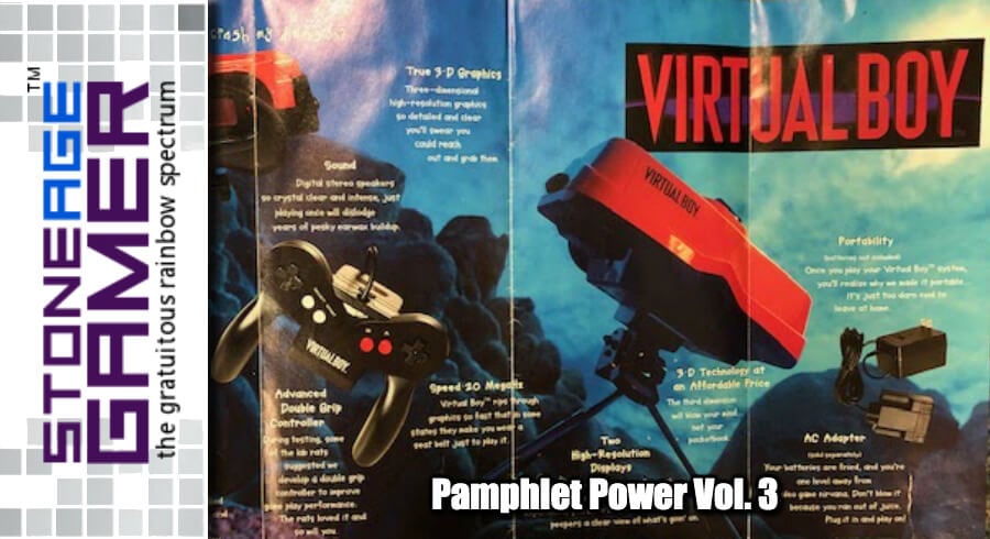
I do love this image though. The red of the Virtual Boy against the blue backdrop is a really cool contrast. Let’s see where this goes.

And now we’re in some sort of Mad Max style post-apocalypse? I’m really not sure what’s going on here, but they’re hitting all the right notes again with the color scheme, which is pretty weird considering what they’re advertising. The stark yellow sky looks really cool with the red of the Virtual Boy. It’s still not telling me anything about what the thing is, or what exactly it can do, but at least it’s doing nothing in style. Let’s keep unfolding, shall we?

Okay, now we’ve found the meat and potatoes, as it were. I love that weird controller so much, and this whole unit still looks super futuristic. We all know it wasn’t, but as a kid looking at something like this, it wasn’t hard to imagine seeing it as the future of gaming. 32 bit processing, true 3D graphics, high resolution displays, it’s got all the buzzwords of the day. And again, that blue looks great! Let's see some games.

Nintendo knew this was going to be the hardest thing to sell. The Virtual Boy looks neat, and it’s super cool… on paper. In practice, when you’re actually trying to show off games that only display in red and black, that’s a much more difficult thing to get across to consumers. I have to give them credit though, they did a pretty decent job here.
Yes, the layout is fairly confusing, but when spotlighting Virtual Boy games via screenshots, a little misdirection probably was their best plan of action.
What they’re showing here though is pretty good-looking, from a certain point of view. As a fan of massive, expressive sprites, the Mario’s Tennis, Wario Cruise (I still think that was a better name than Virtual Boy Wario Land, but whatever), and Teleroboxer games stood out immediately. Oh, and Mario Clash! I’m a huge fan of the arcade Mario Bros. game, so when I saw this, I was immediately sold.
There are a couple of things about this poster in retrospect that are pretty fun too. First, that screenshot from Waterworld is a complete fabrication. That game doesn’t look anything like that. Pretty sure that’s a screenshot from a different Waterworld game that they just colored red and black.
Second, how about that GoldenEye game? That never came out! Looks like it was some sort of vehicle based game? Weird.
There’s no sense in droning on and on about how the Virtual boy failed on nearly every conceivable level, so let’s see what Nintendo was cooking up with 64 bits… in PAMPHLET form!
Change the System

Well, we’ve officially gone from not needing to get a new system to the tagline literally being “Change the system.” Also, “your brain won’t believe your eyes” is a pretty bold claim. I may not like the Nintendo 64 much in retrospect, but the hype surrounding this thing before it launched could be poked with a fork. Let’s peek inside.

Look at that controller. That thing is completely bananas. I still can’t believe it’s real. That siad, there’s no denying that it looked futuristic back then. More hilarious than anything else though is “unparalleled anti-aliasing to prevent the blocky, pixelated look of other systems.” Nintendo 64 has the blockiest graphics on any system ever made!
Visually, there isn’t a whole lot here. It’s got a decent look, but let’s hope it gets flashier from here.

WHOA! It did!
Man, just look at this! Mario swinging Boswer by the tail is front and center, right where it belongs. But the two actual screenshots in the back are from Wayne Gretzky’s 3D Hockey and Mario Kart 64, with characters from Pilotwings 64 and Killer Instinct Gold making it look like the N64 was already slated to have quire the diverse lineup. The ref in the hockey game in particular looks fantastic. There are no bad choices here.

And now, the games themselves. This is still pre-launch, so it’s really cool seeing stuff like StarFox 64’s original logo (basically the SNES logo with a 64 slapped on the end), Kirby’s Air Ride (which skipped the Nintendo 64 entirely and was released as Kirby Air Ride on GameCube), and Super Mario Kart R (later renamed as Mario Kart 64). From a visual design perspective, this looks cool. As a thing you actually try to read, it’s pretty unwieldy. I remember when I got this thing, rotating the open poster around in the car on the way home, and my parents wondering what the heck I was doing.
All in all, this is pretty great stuff, but there's still one more.
Get N or Get Out

I’m sure I missed some along the way. I have to assume there was at least one other Nintendo 64 pamphlet between that one and this one, but this is the only other one I came across in my travels. It’s a really interesting juxtaposition too because while the first one was basically the most hype the Nintendo 64 ever saw, this one comes to us on the eve of the Dreamcast launch, and a couple years of Nintendo getting the snot kicked out of them by Sony.
It’s a pretty snazzy cover though. Let’s get started.

It looks like Nintendo was trying to be a bit edgy again, which is understandable considering their position. They had been branded the kiddy system, and as such missed out on a lot of the games that were changing the video game industry at the time. Titles like Resident Evil and Tomb Raider were common on PlayStation, but rarities on Nintendo 64. They weren’t about to give up though.
This is an interesting trio of games to start off with, especially considering how weird this art is for Ocarina of Time. The colors make it look more like Majora’s Mask, but if they wanted folks to think of the Nintendo 64 as a palace they can go for dark and adult material, I guess this image does that. NFL Blitz and Turok 2 were also considered pretty extreme, and there you have it. Nintendo going directly after that PlayStation audience.

And here we have... 9 whole games. Even I thought this looked sparse back when I got it. The games were relatively exciting, especially Rogue Squadron and F-Zero X, but it’s so weird seeing this lineup as Nintendo’s focus when almost none of it is what the system was remembered for. Rogue Squadron, F-Zero, WCW/NWO Revenge, and Banjo Kazooie are still games people associate with N64, but the rest are all but forgotten, disposable sports games, and Cruis'n' World.
I like the Get N or Get Out slogan, but what’s going on in the background? I know it’s someone covering their face with their hands, but it just looks… odd to me.
Well, I hate to end this adventure on a down note, but unfortunately that’s the last one I have. Nintendo went through some sort of dark times following the Nintendo 64’s launch, but it’s great to see them back in full swing today with the Switch. Now if only we could get them to start giving us the weird games like Kid Icarus, Rhythm Heaven, and stuff like that too.
Did you have a favorite Nintendo pamphlet? Do you wish they still made them? Let us know!