Folders on Switch are an UNMITIGATED DISASTER!?!
Kris Randazzo
March 23rd, 2022
11 minute read
Nintendo adds folders to Switch in THE WORST WAY POSSIBLE!?!
5 years later, Nintendo finally added folders to the Switch UI, and people are FURIOUS. Me? The folders make me extremely happy, but it turns out I’m VERY alone in that state of mind. People absolutely despise these new folders with a fiery passion inspiring countless all-caps tweet storms about how mind-numbingly stupid, lazy, and greedy Nintendo is because of them. I’ve seen them referred to as the worst possible implementation of a folder system, and I’m honestly confused.
Yes, folders should have been implemented years ago, but what exactly is so bad about how they work on Switch?

What's the point of folders in the first place?
I think the first thing that needs to be clarified is exactly what the purpose of folders (or "groups" as Nintendo is calling them) is, and then compare that to what the biggest complaints are. For me, and to the best of my knowledge, in general, the purpose of folders is to provide a more versatile organizational system to a console’s UI so that you can find things more easily. Otherwise, what’s the point of folders if they aren’t in service of being able to find things more easily, right?
The loudest complaints I’ve seen are about the fact that the folders aren’t on the Home Screen. I sort of get where that impulse comes from, to a degree. I suppose it is slightly inconvenient to have to go somewhere other than the Home Screen when I want to peruse my entire library, but the reason that never even occurred to me as an issue is that’s not really how I go about using my game consoles.
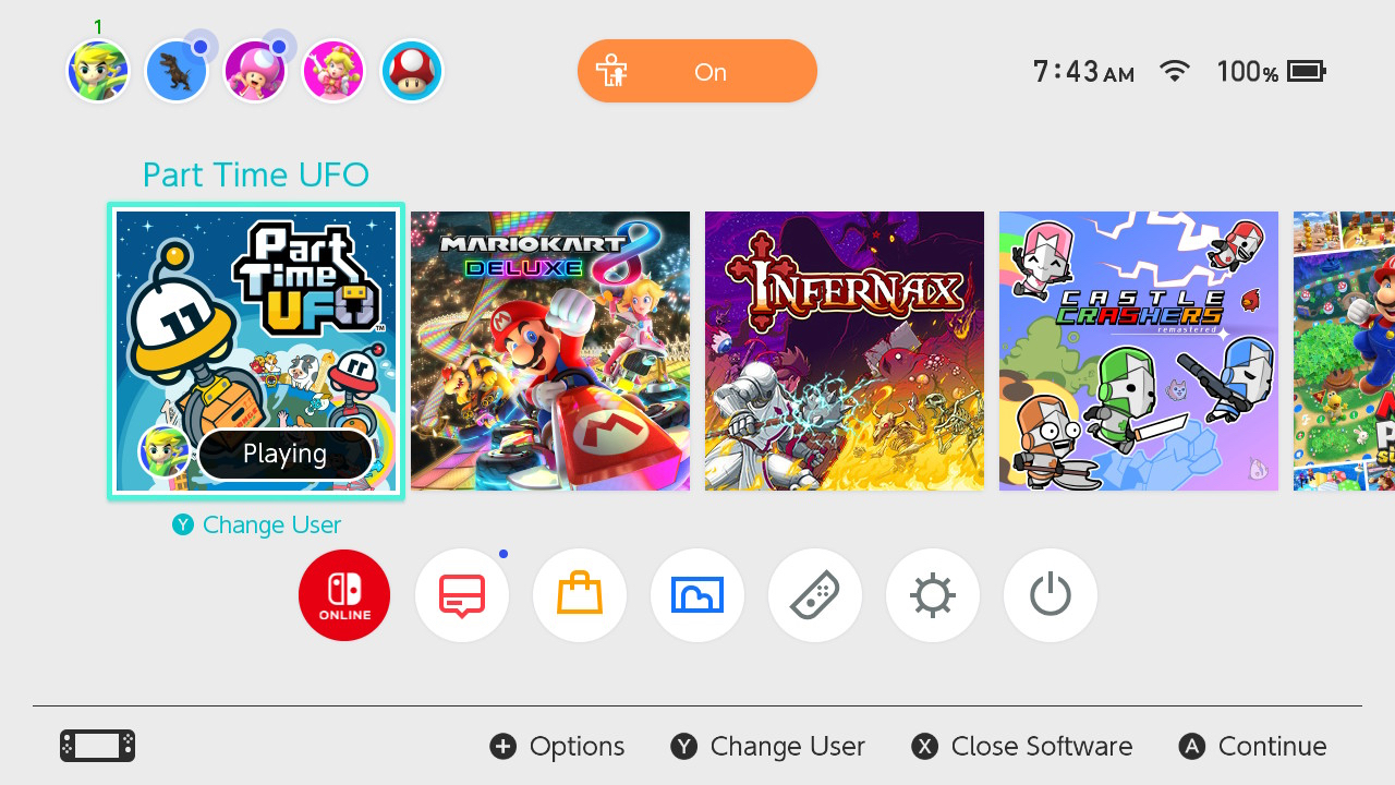
This is clearly a hot take, but the Switch’s UI is my current favorite in terms of actual functionality. I sure as heck wouldn’t say no to some themes or other ways to liven things up a little, but as far as turning the system on and getting into a game, the Switch does exactly what I want it to. My Xbox One is really cool with all its animations and community ads, but their folder system isn’t anything that I’ve been able to figure out. Granted, I haven’t spent a whole lot of time trying to do so, but I would like to think something as important as a folder system would be intuitive enough to not need a tutorial. Then again, Xbox is very focused on being an all in one device, so I guess I understand why it is the way it is. It’s just not my cup of tea.
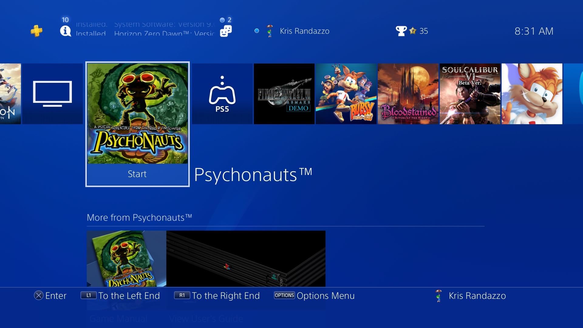
My PS4 also has an excellent interface, and its folder system is very nice. It’s not quite as snappy as the Switch’s UI to me, so if I’m being objective, I think the PS4 UI is probably the “best” of the three. That is, until Monday night when Nintendo added their “Groups” which absolutely put it over the top for me in terms of actual functionality. I know, I’m nuts. But stick with me.
Function over Form
When I turn on my game systems, most of the time I know what I’m doing it for. There are a couple of games that I’ve been playing and those are the ones I’m working my way through, or enjoying with my family on a regular basis. For that reason, the Switch’s native Home Screen is perfect for me. It’s just a list of your most recent activity. If you play something else, it goes to the top of the list. If you download a new game, put a cartridge in, right to the top of the list. It’s simple, it’s effective, and it’s been working out for me just great. Same goes with the PS4 and Xbox One, and I presume the PS5 and Xbox Series, but I don’t own those platforms yet.
The rest of the time, when I turn on my Switch, I just know I want to play a game, but I have no idea which one. This is where I had always wished for folders. Having a place where I can put all the games I’ve been working on, the games I plan on trying next, or even just a specific kind of game, makes the process of narrowing down exactly what I want to play way easier. Sometimes I know I only have a couple of minutes, and I know I have a bunch of games that are great for some quick pick up and play, but I have, I think around 230+ games on my Switch, which makes navigating through my entire library way too time consuming in that instance. But if I could make a folder that just had those games in it, that would make those short periods of time way more productive in terms of actually finding a game and playing it, right?
The thing is, as wonderful as folders are, I don’t want them in place of the way the Home Screen currently works. I don’t want an entire folder of games to move to the top of the list every time I play a game from it. In order to preserve the simple, clean, and incredibly useful Home Screen the way it functions now, folders would have to be somewhere else, which fortunately the Switch UI already has. At the end of the first, I think 12 games that show up on your Home Screen, there’s an “All Software” menu where you can look at your games in specific orders. This is where I go when I don’t know what to play that isn’t what I’ve been playing lately already. With a library as big as mine, like I said, it’s a pretty daunting list to run through. So adding folders to that screen is perfect. Makes 100% total sense to me for the way I play games, and the way I want to organize what I’m up to.
The Past is Always Better
So let’s jump back to why the folders put the Switch UI over the PS4 one for me, and address another thing I’ve seen an awful lot of. There seems to be this groundswell of people who insist the 3DS and Wii U IUs were better, especially when it comes to folders. That they were perfect, and Nintendo somehow made them worse when they finally added them to the Switch. The folders on 3DS and Wii U were effectively the same as the PS4 ones, except you couldn’t customize them quite as well. There were some pretty harsh limits on what a folder could be called and displayed on those home screens, where at least with PS4 you can use more than a handful of characters to describe what you’re looking at. So with the Switch allowing for thorough naming on folders is great.
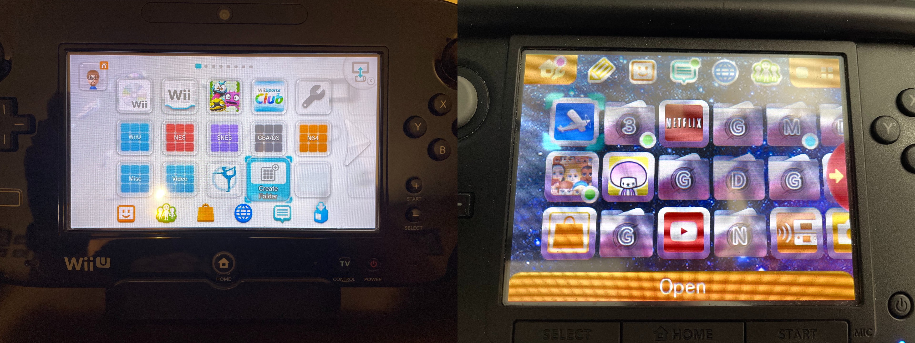
Also, if the game I wanted to play regularly is in a folder, and another game I played often was in another folder, I’d have to go into that folder every time I Wanted to play, or I’d have to take it out of the folder and find a place for it on my home screen. It’s a neat way to store things I never want to use, but in terms of actual daily usability, it could be cumbersome. The current Home Screen solves that problem. But the bigger issue is the fact that the Switch allows you to add the same game to multiple folders.
This means that the folders themselves can be way more accurate. For example, on my Wii U and 3DS, the bulk of my software was Virtual Console stuff. It was cheap and I bought way too much of it. So I organized them by platform. NES, Game Boy, N64, etc. The problem with that method came with games that blurred those lines.
Organization in Practice
Let’s assume the Switch’s folders work just like the old folder systems, and then that wonderful new TMNT: Cowabunga Collection comes out. Where does that go? Do I put it in my NES folder? Because when I want to play NES games, there’s a good chance I might also want to play TMNT II: The Arcade Game for a few minutes. Or maybe it should go in my Arcade folder since it has a couple of arcade games. Or maybe it should go in my compilations folder? My multiplayer folder? The problem with the older systems is that you can only put a game in one place, which limits how easily it can be found or even thought of when trying to decide what I want to play. Now, when TMNT Cowabunga Collections comes out I can put it in my NES, SNES, Genesis, Retro Games, Arcade, 2 player, 4 player, and Beat em up folders. So when I’m thinking to myself, I want to play beat em up, I can open that folder and TMNT will be right there, but if a month later I want to play some SNES games, it’ll be in that folder too.
And I made all of those folders (and more) already.
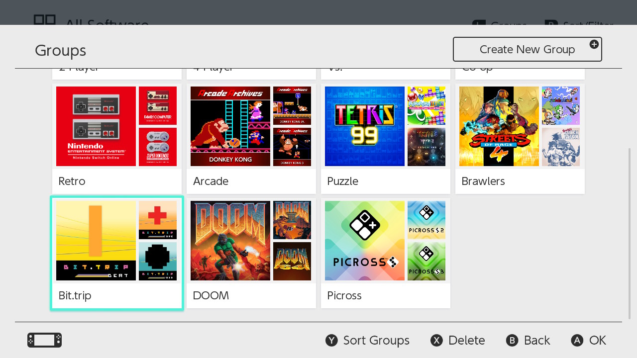
Every night, my wife and kids I sit down to have some family game time. Sometimes it’s board games, sometimes it’s video games. (It’s usually video games). But sometimes it’s hard to figure out what we want to play. When we aren't in the mood for the usual staples and want to try something different, or just something we haven’t played as a family already, we would go to the full library section and run down all 230+ games in alphabetical order. We’d usually wind up just getting frustrated and doing something else, or landing on something we didn't really want to play because it’s what was familiar. That happens a lot when spoiled for choice. But now I have a folder with the games I’ve deemed appropriate for family time, and it’s a nice narrow list of thighs to choose from that isn’t intimidating, or full of games that would get way too frustrating for my 5 year old way too quickly. And the games in that folder are also in my various other multiplayer folders. Multiple folders for different gaming situations. It’s remarkably versatile.
Accessing those menus takes less than 5 seconds, by the way. Look.
The Wii U takes way longer than that to even boot up, so again, this notion that the Wii U menu was somehow better than the Switch is completely and totally lost on me. It was cool, sure, but it was slow and way more limited than the Switch. Same goes for 3DS. It was very good, but I couldn't do what I can do now there.
Maybe this is a Steam thing. It’s my understanding that Steam has all manner of organizational options, so maybe the people who are the most angry about the way folders happened are simply coming from a completely different perspective than myself. I am in no way an authority on the subject. I can only speak to my own experience, and from my perspective this is basically exactly what I would have wanted from a folder system. I absolutely do not want folders on my Home Screen. I want it to show me what I’ve been playing most recently, in nice big blocks, without distraction. Would it be nice to be able to press a button on the home screen to access my folders directly? Sure. But as it stands now, I have to press 3 buttons, let me say that again, 3 whole buttons, to get to my folders. That barely registers as an inconvenience, let alone an all caps-worthy hate tweet about how Nintendo is anti-consumer and everything they do is lazy and horrible.
There’s plenty to criticize Nintendo about. I criticize Nintendo all the time. This though? This eludes me. But as I seem to be in the VAST minority on this one, clearly I’m missing something. If you know what that something is, I respectfully ask that you explain it to me. That’s not me being snarky, I seriously want it explained to me.
Related Articles
The State of EverDrives at Stone Age Gamer
3 minute read
March 21st, 2022
Stone Age Gaming: Nintendo Monopoly Sets
16 minute read
March 21st, 2022

SAG Podcast 403: I’m Gonna Learn Some Languages at You!
1 minute read
March 25th, 2022
Saturn Builder Overview
15 minute read
March 28th, 2022

