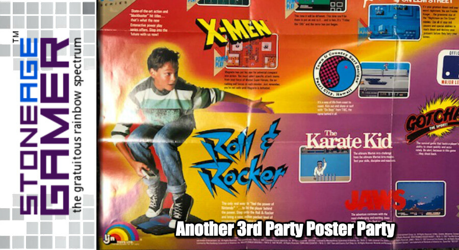
A 3rd Party Poster Party
When discussing retro video game promotional posters, as so many people so often do, it’s easy to think back to the classic Nintendo and Sega ones. They welcomed you to the next level, and told you what kind of power you were playing with. But back in the old days, 3rd party publishers weren’t just those folks who put out a handful of games throughout each year. Back then, 3rd parties didn't want to be included on Nintendo's list of games so much as they wanted to sell you on their line of games specifically.
Nowadays, game boxes are pretty well uniform. A PS4 game has the blue strip across the top. Switch games have a red spine. That kind of stuff. Back then, there was far less uniformity, and 3rd parties liked to come out with product lines that looked uniquely theirs. And even when they didn’t, there was still usually some sort of unifying sense that you shouldn’t just buy Nintendo games, you should buy all of THEIR Nintendo games. Let’s have a look, shall we?
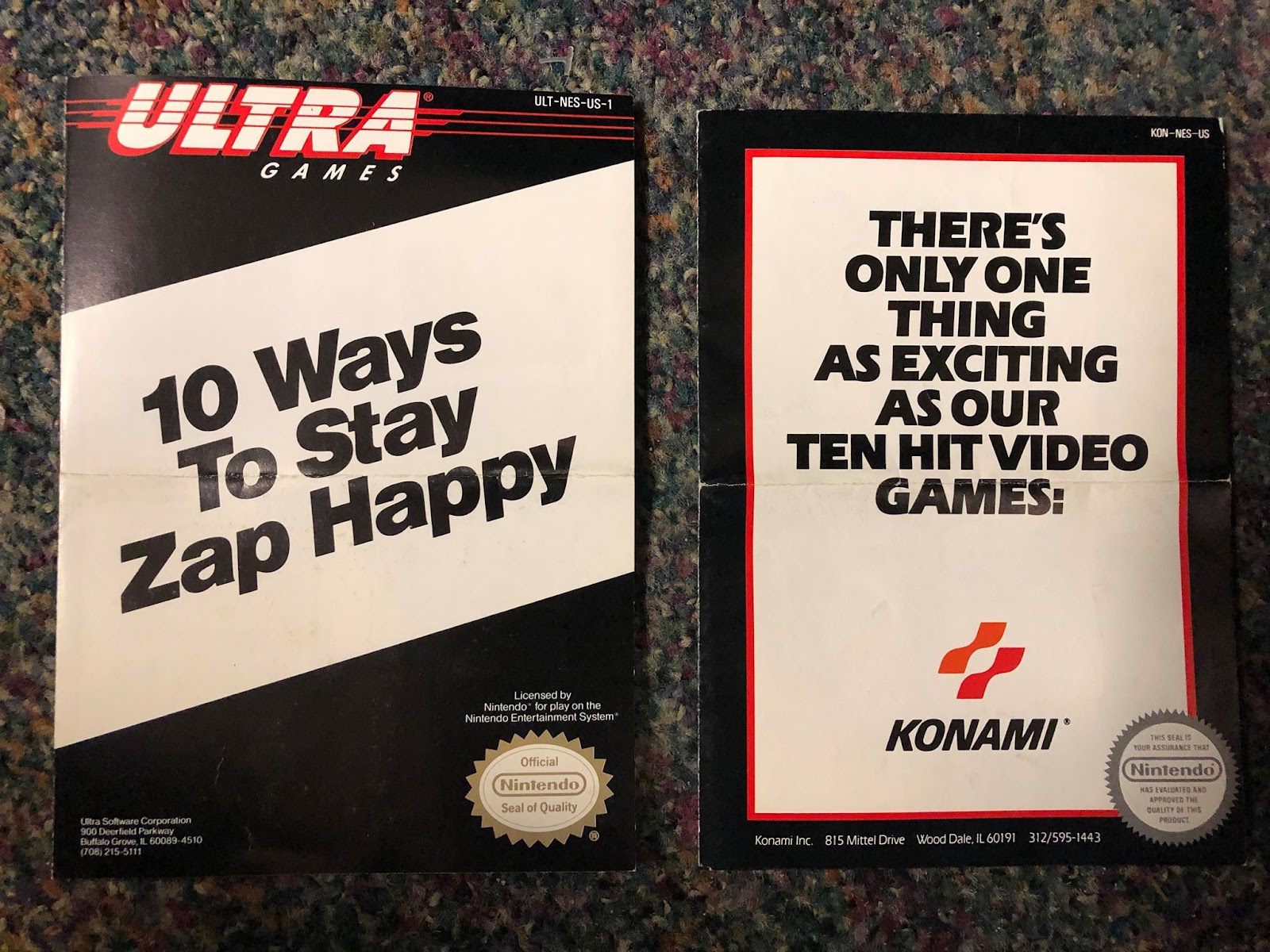
Konami is just about the best place to start for this for a couple of reasons. For one, they ran two different labels in the NES days, and they were both fairly uniform in their appearance. For two, I actually have those posters, so it makes it a heck of a lot easier to write about them. What we have here are two different versions of effectively the same poster. One for Konami’s games, and one for Konami’s spinoff label Ultra Games. Let’s kick it off with my favorite, Konami and their awesome-looking silver label games.

This one’s double sided, and extremely horizontal. It’s almost more like a pamphlet than a poster, but whatever. I hung it up on my wall, so it’s a poster. That’s how that works, right? Anyway, just look at that awesome artwork. The silver label design is freaking timeless. Countless homebrew games and novelty products have borrowed this design over the years because for the most part, these games are all absolute legends. Track & Field, Gradius, and even Stinger and Rush n Attack are all classics in their own right, and they look fantastic all lined up like that.
And then of course, there’s Castlevania. That’s some of the best box art ever made right there. I love how the description tells you to keep your cross high, you stake sharp, and to say your prayers. Pretty sure Nintendo was all about avoiding stuff like that in those days.
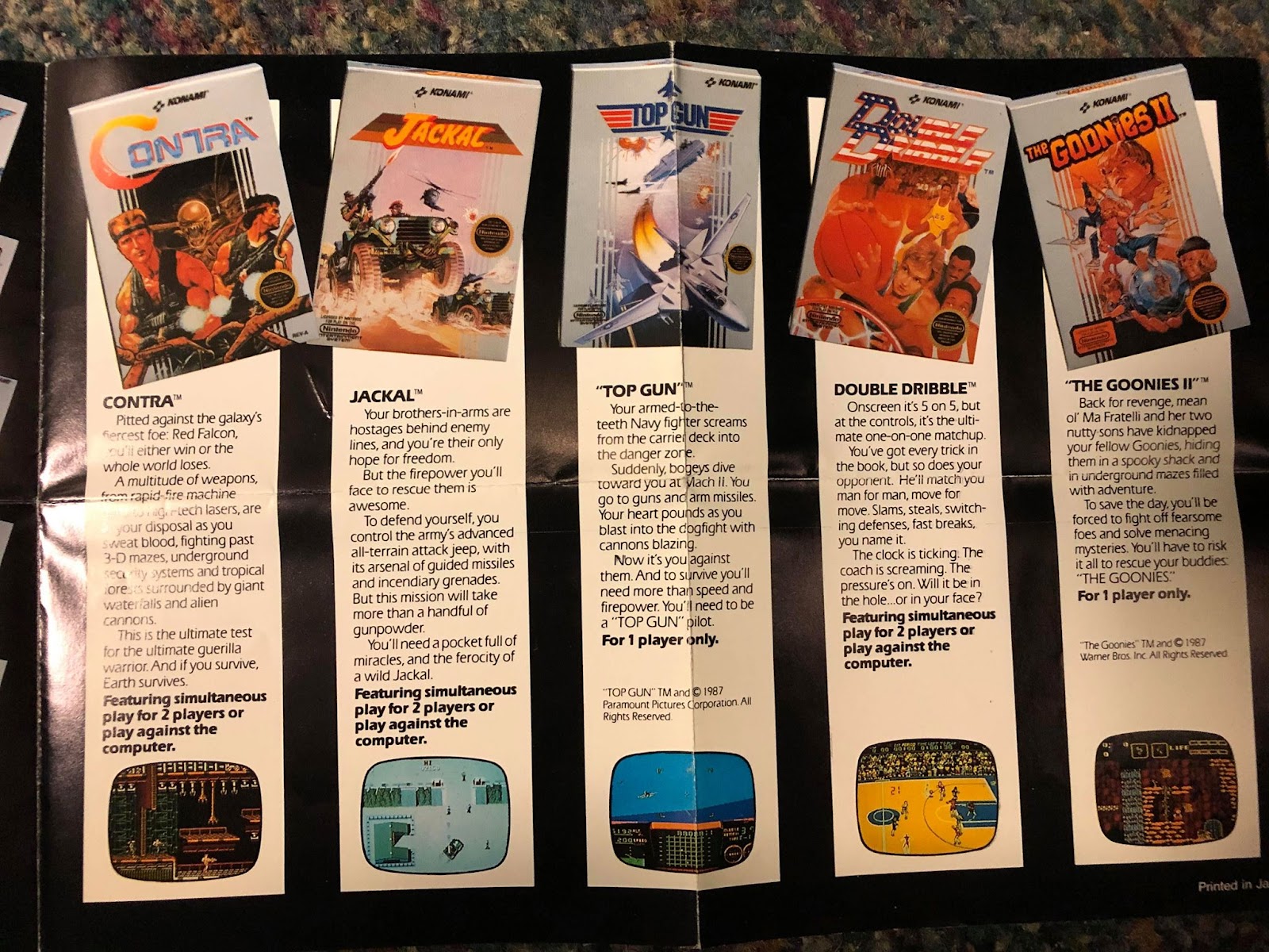
On the other side, you have another stack of absolute legends. Goonies II, Double Dribble, Top Gun and Jackal are great. Yeah, I know folks hate on Top Gun, but I loved that game. Regardless, imagine if you had never played any of them before and this poster was your first exposure. This poster here makes a very good first impression. The screenshots all make their respective games look amazing, and the artwork on those boxes is lightyears ahead of the black box stuff Nintendo had been releasing.
And, of course, then there’s Contra. A classic through and through with just about the most enticing box art imaginable for a kid in the 80s. It’s like Alien and Predator had a kid and that kid came to kick all sorts of ass on your NES.
And that’s what’s so great about this one. It’s got a sense of style with the staggered box art, but all in all it’s a very clean look. It’s bold, and does an excellent job of selling people on what it wants them to buy.
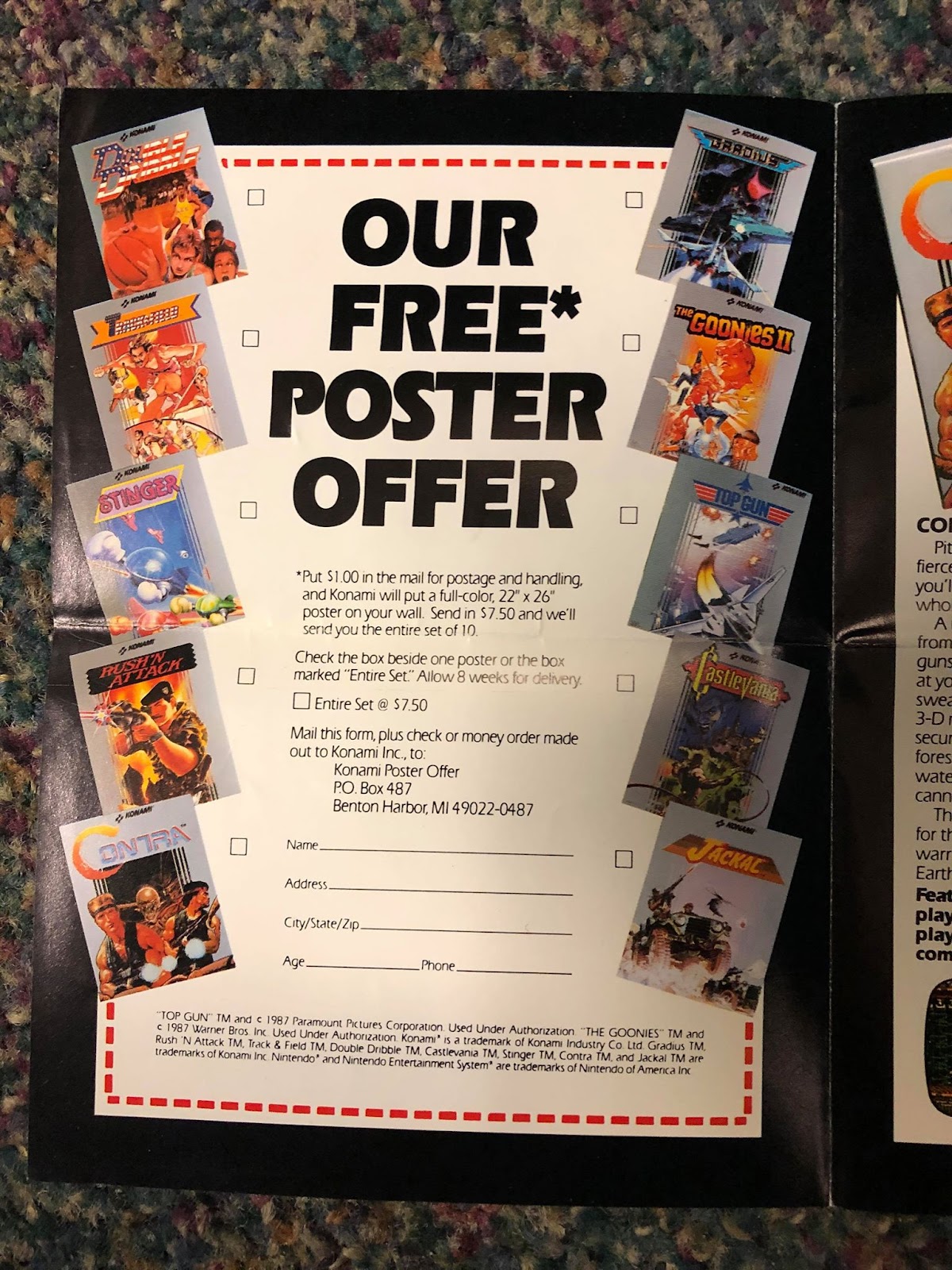
But before we move on to Ultra Games, look at this right here. What I wouldn’t give to go back in time and order every single one of these things. I got all my Konami games second hand back in the day, so I didn’t come across this poster offer until is was WAY too late to even think about ordering these things, but how awesome would they be today? I did a quick eBay search and they go for some serious money (no surprises there) but I miss this stuff. They should totally make more mail away posters for video game art these days.

So here we are on the other side of Konami’s NES library, the Ultra Games stuff. These ones are far less uniform than the silver box games, but they still make for one heck of a lineup. Well, maybe not this side so much. Not that any of the games shown here are particularly bad. In fact, the NES port of Q*Bert is pretty good! But the rest of them aren’t super memorable, with the exception of Silent Service which I only remember because we had a ton of copies of it at my FuncoLand back in the day, and it was dirt cheap. Still, like the silver label poster above, the layout is simple and effective. Regardless of their actual quality, they all look pretty cool here. Though it’s kind of lame that they couldn’t come up with any better placeholder box art for Mission: Impossible.
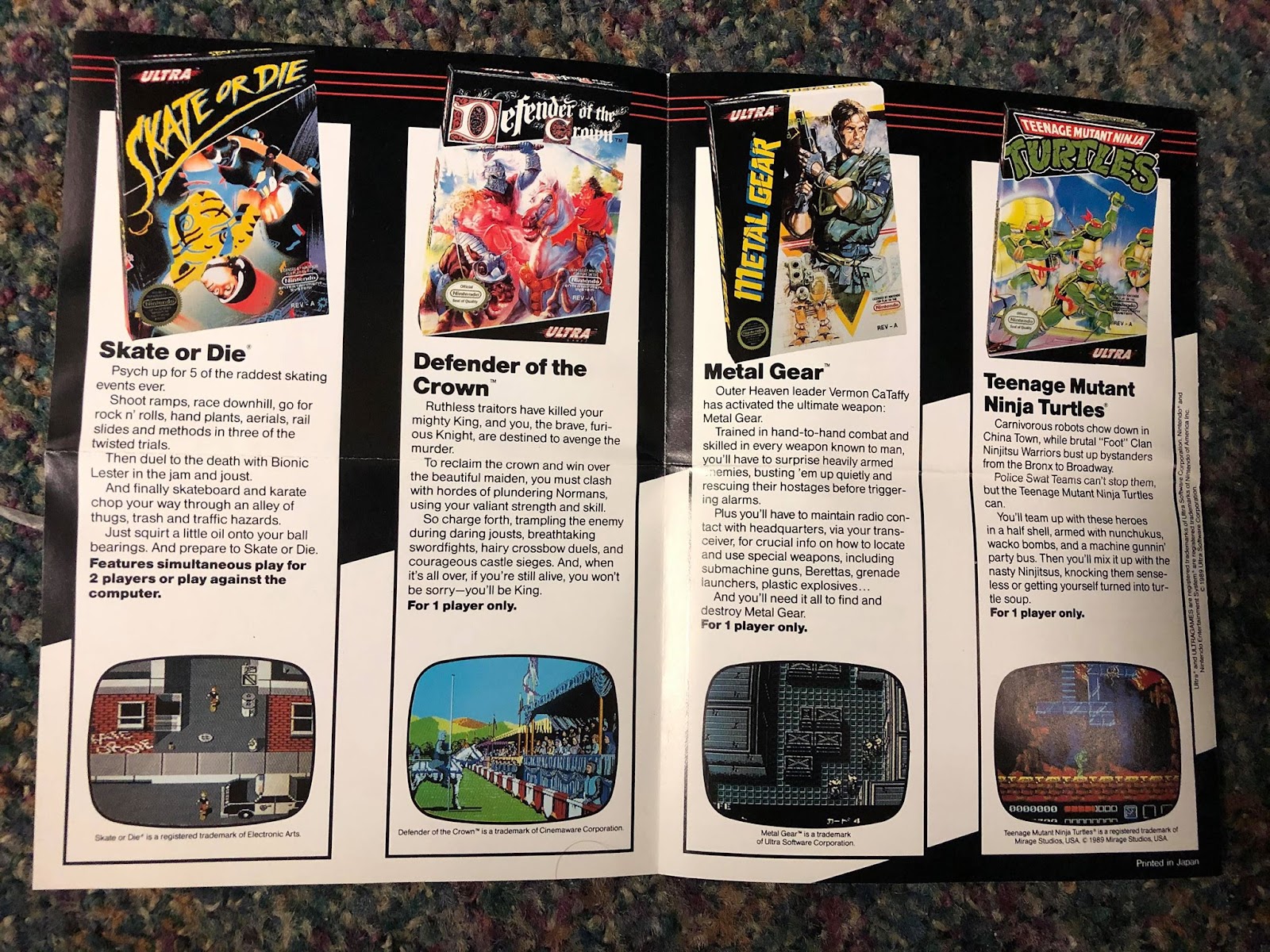
But flip that sucker over and hot diggity dog is this a good looking bunch of games or what? Skate or Die, Metal Gear, and Teenage Mutant Ninja Turtles may be some deeply flawed games, but they’re also games that pretty much every NES owner had, and they all have some pretty rad box art if I do say so myself. I don’t have much in the way of experience with Defender of the Crown, but I can understand why they put it here with these other heavy hitters. That screen shot is kind of amazing-looking.
These posters really do remind me just how amazing Konami was back then. The quality of their titles was something else, and while their Ultra Games label wasn’t quite on the same level as their name brand business, these games are such a huge part of the NES library, it’s hard not to lament what a weird shell the company has become today. Anyway, back to the posters.
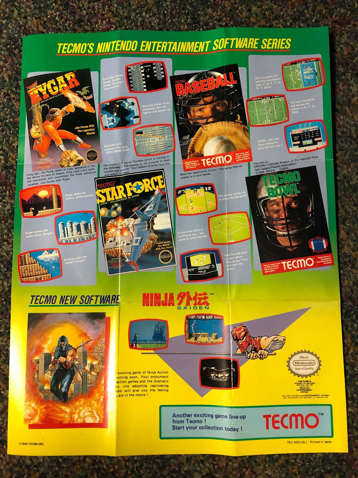
Before they were Koei-Tecmo, they were just Tecmo, and they were kind of amazing. It’s easy to look at Tecmo now and not really think much other than the endless barrage of Dynasty Warriors games they like to fling out these days, but when you look at old posters like this, these guys were freaking pioneers! Well, of game design. Not necessarily of poster design.
It’s kind of like someone in their marketing department had seen the opening credits for Saved by the Bell and came to the conclusion that young American kids were really into geometric shapes. Let’s put a big purple triangle at the bottom! The kids will think it’s totally rad!
However, if you can get past the rather silly design, just look at this lineup. Rygar was this fascinating reimagining of the arcade original. Tecmo Bowl is still regularly played to this day. Tecmo Baseball may not be the best baseball game on the NES, but it sure is fun. Star Force is, well, Star Force. But at the bottom, you have what was probably a lot of people’s first look at Ninja Gaiden. The orange ninja dude is a weird choice, but all 4 other images were fantastic picks to show off the majesty that is the original NES Ninja Gaiden.
The full cover artwork is gorgeous, the cutscene of him standing before the castle is one of the most iconic images in all of 8-bit gaming, Malth pulling down the lightning looks nuts, and the masked devil is mysterious as heck. I saw this poster after I had already played some Ninja Gaiden, but well before I was able to actually get to any of these parts in the game, and I tell you, these images filled me with insane anticipation for what was still to come. And they made me genuinely terrified to fight against Malth.
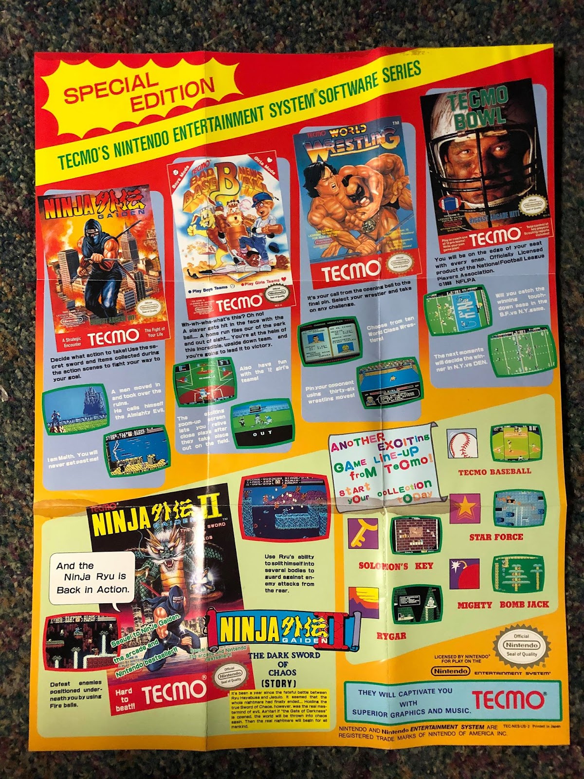
For their next poster, they certainly made better use of the space, though some of thees choices here are kind of questionable. The actual games they’re showing are great. Highlighting the sequel to their smash hit Ninja Gaiden was absolutely the right call ,and the images they’re showing here have everything they need. Those shadow ninjas were such a cool powerup. Back at the top, we have the same screenshots from Ninja Gaiden and Tecmo Bowl, since those were both still pretty big blockbusters. The two newcomers weren’t exactly anything to write home about from my perspective, but I love how in the bottom right they called attention to the weird icons they created for each of their games up to that point. Kind of a weird way to promote them since kids would be looking for the actual game boxes in stores not some weird little icon, but what do I know?
So let’s examine some of the weirder points now. What in the name of sanity is going on with that font by the game icons in the lower left quadrant? It’s barely legible, and leaves a ton of negative space everywhere. What were they trying to accomplish? And speaking of fonts, could they really not come up with anything more dynamic than the super basic dark blue on lite blue for their slogan at the bottom? (though I am a big fan of how they call attention to their music). Meanwhile, over on the Ninja Gaiden II box, what is going on with that speech bubble? Who is it supposed to be attached to, and what’s up with the spacing of the words? Weird. Charming in retrospect, but weird.
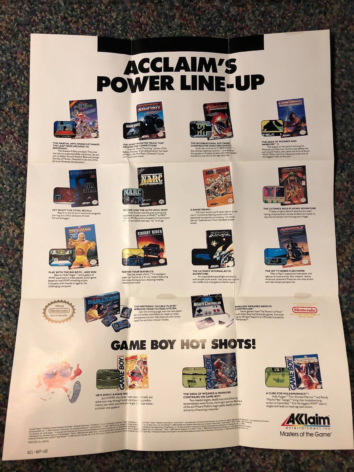
Let’s finish off with a company that isn’t around anymore. The name “Acclaim” may not mean much to the gamers of today, but back in the 90s they were one of the biggest names in town. This first poster may not have much in terms of style, but there’s no denying the amount of hype these titles brought to the table. Double Dragon II, IronSword, Wrestlemania, NARC, that weird box art for Arch Rivals, there’s so much cool stuff going on here. They even tossed some Game Boy love at the bottom in addition to a couple of their own accessories.
Still, there’s no denying some of the hype here kind of gets tossed out the window thanks to the remarkably simple stark white background. This thing’s got no style!
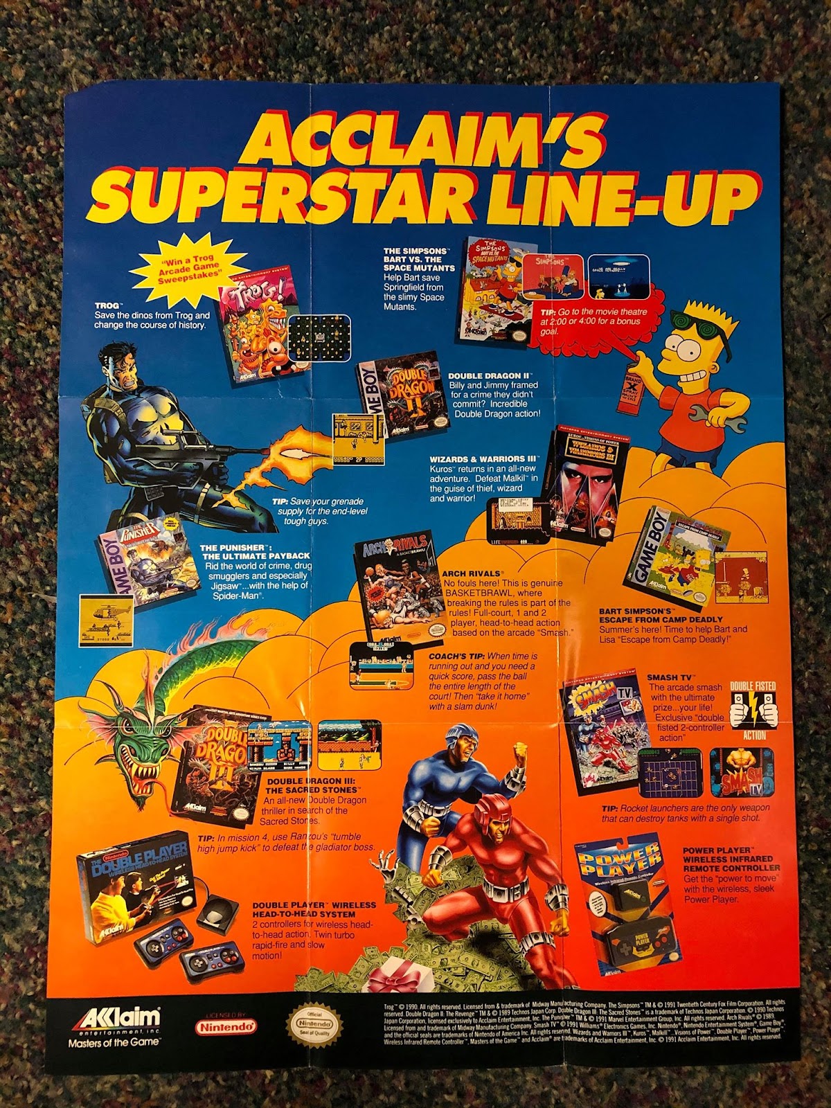
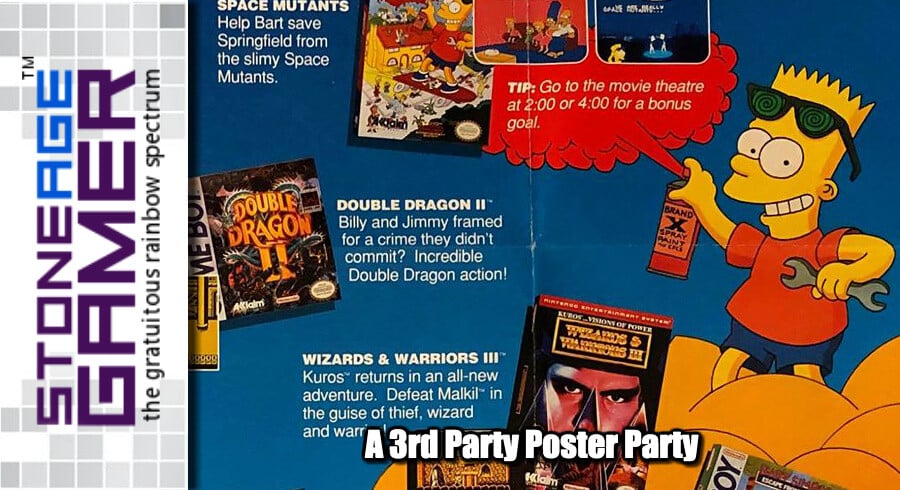
Fortunately, they got over that right quick. Now we’re talking. Bright, bold colors, staggered images, big awesome character art, this poster has the goods. Not only do we have Bart Simpson right at the top, who was enjoying quite the insane level of popularity at the time (Do the Bartman!) but there’s that totally kick-ass Punisher artwork, the dudes from Smash TV looking all futuristic, and… the dragon from Double Dragon III? Sorry, the dragon from the box art for Double Dragon III since there aren’t any actual dragons in the darn game. Doesn’t matter, this poster rules, and positively reeks of early 90s radness.
Well, that takes care of some of the heavy hitters, but there’s still plenty of 3rd party developers who wanted you to buy their entire lines of games. Come back in one week for a second dose of 3rd party poster action!